What I really don’t like about Chrome for iOS
Chrome is my default browser on all of my devices. On iOS though, there are few things that really bug me.
Useless tabless state
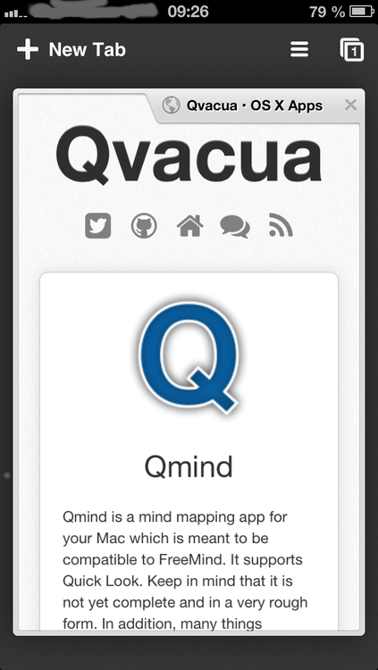
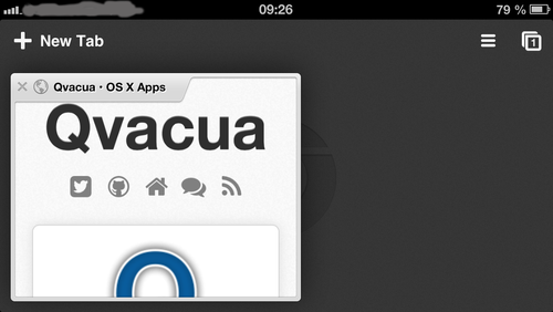
Look at the following two screenshots:


I get this state when I close the last tab; what is the purpose of this state? Should I look at the Chrome icon for one second before I have to press the “New Tab” button in order to get going? It’s just useless. Safari does a better job and opens a new tab immediately after the last tab is closed. In addition, the position of the hamburger button is different when there are tabs present:

Position of Close Button
The position of the close button changes when the device is in portrait or in landscape mode:
Right, left, what now? This is really annoying…