-
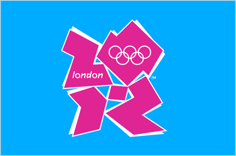
Sometimes as a designer you have to take a step back. Compose your thoughts. And know that sometimes, your not “allowed” to let things go. If the 2012 Olympics Logo was the result of a Creative dept that got together, brainstormed and came up with this for submission….Then your not doing it right.
“Im sorry but I have never seen something so amateur in my career. How did this happen?” Ashley Oblinger
How this Identity was Approved is beyond me. And almost an insult to design itself.
Who is responsible you ask? Wolff Olins - a very reputable agency who has a very respectable brand history. you may remember this campaign:
http://www.wolffolins.com/work/red
Im shocked to say the least…
Wolff Olins work: http://www.wolffolins.com/
Please see alternative 2012 Olympic design here:
http://blog.iso50.com/28832/alternative-london-olympic-posters/
**in no way do these comments reflect the facts of such identity. These are only opinions of fellow designers. and should in no way be considered a negative bash on Wolff Olins this is only offered as constructive criticism and should be treated as such**
-
twister111 liked this
shlee1 posted this