Interview with Paul Taylor of “Wapsi Square”

Let’s start with some of the basics of “Wapsi Square”: you initially started out as a professional photographer, and this no doubt influenced the character of Amanda. How did you get into comics, and at what point did you decide to pursue “Wapsi Square” full time?
I’ve always had a joy and desire for drawing, it was only after realizing that a short stop-action film that I wanted to make with my character Monica and her dog Dietzel was getting too big and too many ideas kept coming, that I had to find another way of exploring a way to get their stories out of my head. It was my wife who suggested the comic book/graphic novel route. It was a rough start, but there weren’t as many doing web comics back when I started and it was a bit easier to get a foothold.
Back then, everything that I wanted in the comic was put on bristol. Even when I messed up, I used good-old-fashioned white-out. Even though the comics were sparse, it was a long process. I did all the drawing directly on the bristol with blue pencil, erasing, fixing, then inking, fixing with white-out, inking over that, … basically a pain in the ass. I have a process now where I draw everything on drawing paper first (it‘s not as intimidating as trying to get it right on more expensive bristol), then I scan all the sketches into Photoshop, lay them out the way I need them, print that out, then I use a lightbox to transfer that to bristol to be inked. It sounds like just as many steps but it goes a hell of a lot faster.
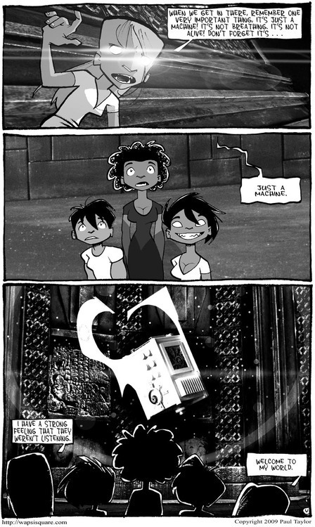
A lot of both. It was getting difficult to get the stories I wanted to fit in the horizontal format and a page layout gave me the freedom to play more.
It was also around this time that more gray tones started showing up in the strip, and you’ve really seemed to develop an affinity for it. Was this a conscious choice? And how did you start gathering up your patterns?
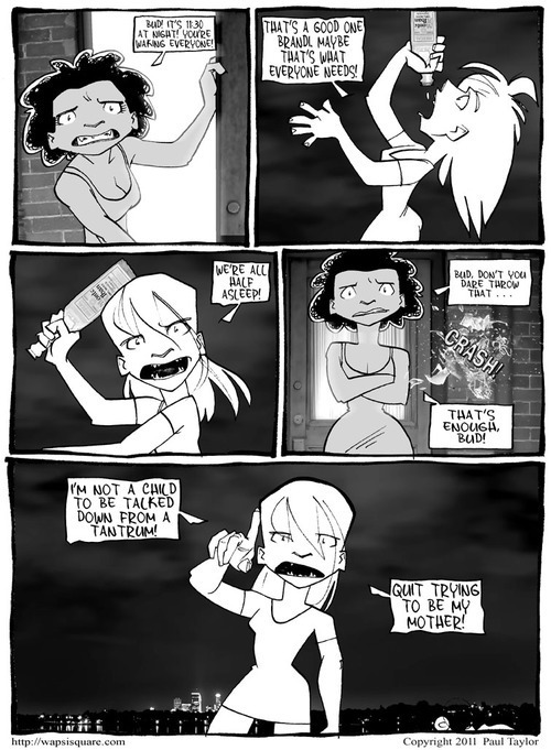
I don’t know how conscious of adding all the gray tones but it felt right, and it seemed like the full page layout kind of needed it. Quite a lot of the patterns for the backgrounds and other textures are a stock of photos of mundane things like rusty doors, cement, tree bark, out of focus lights, etc. Having my background in photography, it seemed logical to still give my camera a chance to do its thing.
I hit a point when I was working on my drawings but still feeling separate from the whole process. This may sound odd, but even with being involved with the drawing and the inking, the whole thing felt very sterile to me by comparison to the much more hands-on process I hand when painting or charcoal work. I needed something that was quick and easy, like the brush and pens and markers seemed to be a logical analog choice. It took a bit of experimenting with different brands before deciding on Copics. The limited palette is due to my love of black and white photography, and also because I feel like I have boxing gloves one and trying to tie my shoes when it comes to using a larger color palette.
It’s pretty close to the process that I use for doing my comic. I’ll do thumbnails on paper and then sketch out highlights of the image as well as I can from what is in my head. Sometimes on the paper, it may take on a different life and I’ve found it best to listen to this and go with it. Once it’s transferred to bristol and I get to the marker stage, I’ve found the best approach is to try not to be too careful. Granted, I don’t swing my arm around and expect things to fall in place, but I’ve found being too worried about what I do can end up making things look sloppier than working faster.
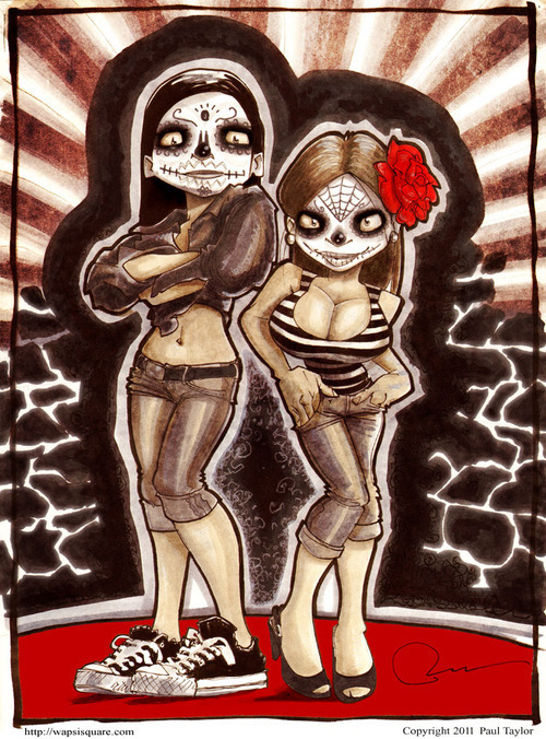
What was there a special process for your giclee prints, particularly ones like “Day of the Dead”?
That print in particular involved finishing the picture with the markers, scanning it into Photoshop and layering different texture photos over it to give it more depth.
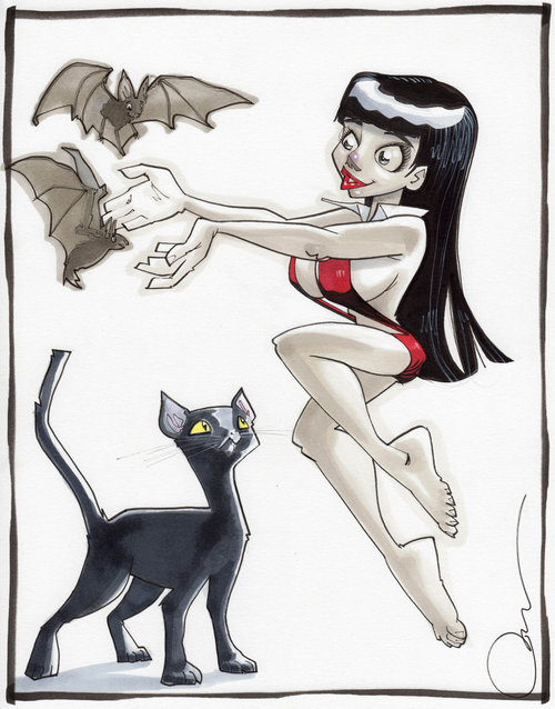
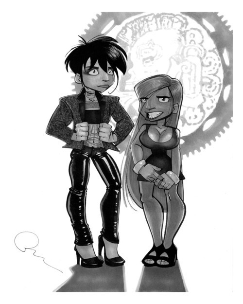
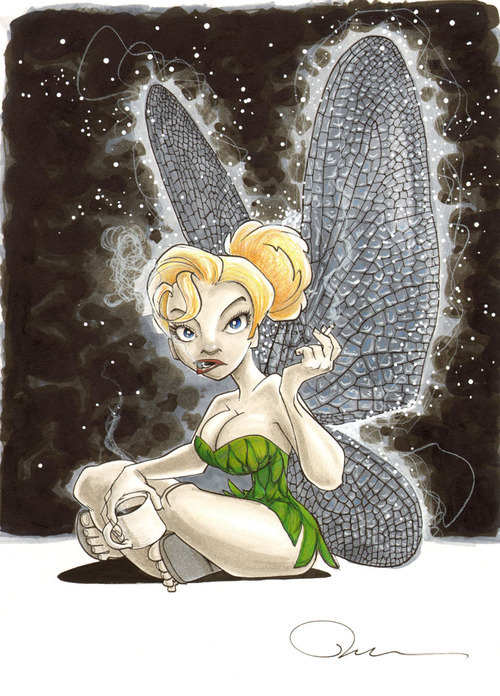
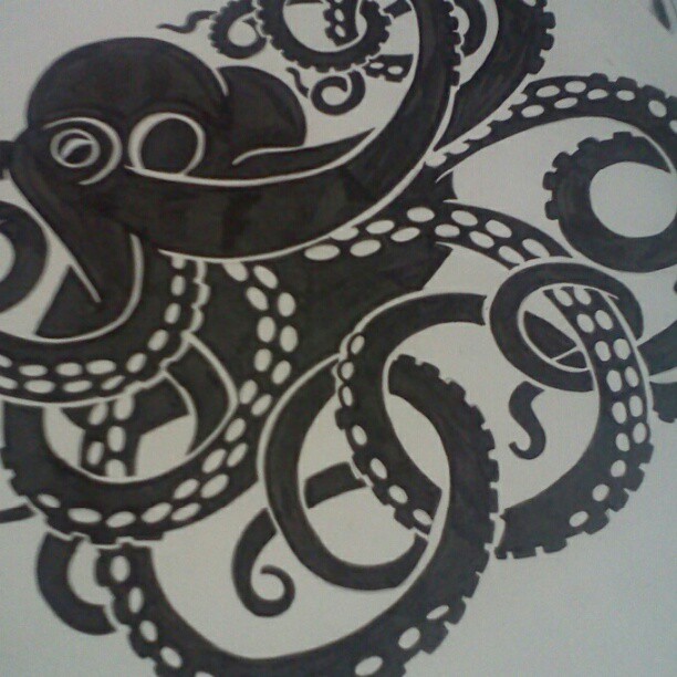
Mostly it’s personal taste. I have a great love for creepy and cute things and when they’re blended together, all the better.
Definitely! I think I might try to work with a theme for each.
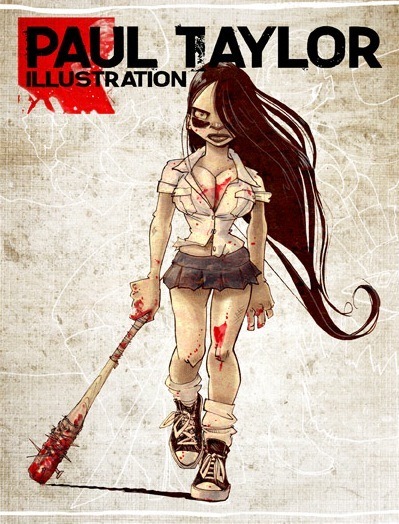
Paul Taylor’s new book “Paul Taylor Illustrations” is available for pre-order now. “Wapsi Square” is available in numerous bound volume forms, and can also be read for free on the “Wapsi Square” website, which updates five times a week.


 warpcoreejector