
“Its virtue is immense. Good writing in the classes cultivates the eye, hand, and judgment, promotes habits of accuracy, observation, neatness, and good taste, conduces to good order discipline and method, and by contagion infuses a salutary stimulus into every other branch of study taken up.”1
John Jackson, The Theory and Practice of Handwriting, 1896
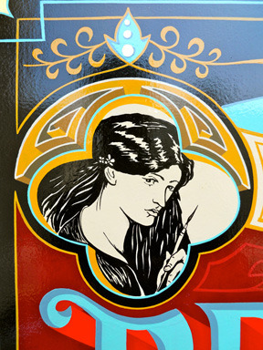
Detail of Josh Luke’s The Pre-Vinylite Society, 2014
What is the Pre-Vinylite Society?
The Pre-Vinylite Society is a loose network of self-ordained sign enthusiasts and advocates for an improved urban aesthetic. The Pre-Vinylite movement grew out of co-founder Josh Luke’s desire for an inclusive forum where sign painters of all levels could share their work and get constructive advice without judgment. Deriving their name from the Pre-Raphaelite Brotherhood, a group of 19th century English artists and writers, the Pre-Vinylite Society aims to create signs, art, and writings that convey an astute cognizance of the aesthetic built environment and a desire to create new, forward focused art that respects the traditions and techniques of the past.
The idea of a “pre-vinyl” world connotes a time before vinyl sign technology nearly decimated the hand painted sign industry in the 1980s. But despite the emphasis on a bygone era that “Pre” suggests, the Pre-Vinylites are not are not a society of Luddites, shunning technology or advocating for a return to a “simpler” time. Pre-Vinyl does not equal Anti-Vinyl. The Pre-Vinylites do wish, however, to commemorate the pre-vinyl era and they refuse to let the age-old traditions of the craft die out. The Pre-Vinylites are future-oriented—they care about tradition because they value posterity’s ability to access history. They believe that artistic vigilance in the face of mass conformity can deliver us from a homogenous existence.
•PRE-VINYLITES UNITE•

Bob Dewhurst, Script is Descriptive, 2014
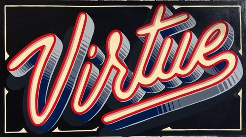
Its Virtue is Immense: a Pre-Vinylite Society Tribute to Script Lettering
This show presents examples of script lettering from some of the best sign painters from around the world and showcases the aesthetic qualities of beautiful hand lettering. But its message runs much deeper than aesthetics alone. With the current debate about the future of cursive handwriting in American schools, this show explores questions of privilege, access, and the role of the human hand in an increasingly digital world.
Script lettering conveys elegance, grace, sophistication, and class. In centuries past, a “good hand” was viewed as a sign of virtue and breeding, while a “bad hand” (never mind a total inability to write in cursive) was deemed uncivilized. Script lettering featured on a shop sign can communicate that the goods or services provided are high quality. But hand lettered cursive—whether painted on signs or scribbled in personal diaries—is becoming endangered as more and more schools are forgoing its instruction in favor of more practical skills like typing. In our current technological age of immediacy, cursive writing, like sign painting, is considered aesthetically pleasing but non-essential.
As the debate about cursive education rages, advocates and opponents stake their claims on cursive’s relation to the value of aesthetics, its role in cognitive development, its usefulness in the face of perpetual advancements in technology, and the part it plays in developing or maintaining a sense of self. At the heart of the arguments, however, is a question of history and posterity: what will we lose if cursive is abandoned? Typing is faster, more legible, and more accessible than handwriting. In a similar vein, vinyl signs are faster, cheaper, and more interchangeable than a hand painted sign. If cursive handwriting is no longer taught in schools, only those with initiative and access will be able to learn it. If cheaply made, poorly designed signs are allowed to pervade our cities and towns, how will anyone know what a quality sign looks like?
This show presents a response to the current debate about the future of cursive handwriting and a rally for continued appreciation of hand painted signs.

Excerpt from B. Hearn’s The Art of SignWriting. (London:B.T. Batsford Ltd., 1953), 38
Sign Painting and Cursive Handwriting
Sign painting as a viable trade reached its zenith in the mid 20th century and had, by the 1980s, declined into near oblivion. The advent of vinyl technology in the late 20th century made the production of signs faster, cheaper, and easier—allowing any novice with the funds to buy a vinyl plotter and the wherewithal to punch the buttons the ability to embark on a lucrative career as a sign maker. Fleeting were the days of apprenticeships and trade schools that taught the centuries-old secrets of how to shape letters with a lettering quill and how to make gold stick to glass. With the introduction of vinyl signs came a new era in sign-making: one that contributed greatly to the way many of our cities and towns look today.
In his 1956 Lettering for Advertising, Mortimer Leach explains that “the Formal Scripts, or round-hand letters, have been used in advertising layouts for many years. The classic beauty and legibility of these forms has kept them from becoming dated and I feel sure that they will continue to be of value, despite the everchanging trends in layout design.”2 At the height of the mid 20th century advertising boom, Leach never dreamed that script letterforms would not only become untrendy, but eventually illegible as future generations will no longer know how to form or decipher cursive writing.
Script, or cursive penmanship, like sign painting, is experiencing a fate of endangerment as more and more schools are opting to omit cursive handwriting from their curriculums. The Common Core, an initiative that details education requirements for children K-12 in the language arts and mathematics, does not list cursive handwriting as a required skill for any grade. According to their website, “forty-five states, the District of Columbia, four territories, and the Department of Defense Education Activity have adopted the Common Core State Standards.” With many schools prioritizing competence on standardized tests over comprehensive learning, cursive handwriting is being scrapped for more practical skills that are, as the Common Core suggests, more “relevant to the real world.” While the decision to cut cursive instruction is still up to individual schools, for many public schools already struggling with inadequate funding, the decision is pretty clear.
An Extremely Brief and Incomplete History of Penmanship
The history of hand lettering goes back to the formation of the first phonetic alphabet sometime before the 1st millennium BC. Before the 15th century, almost all writing completed in Europe was done by monks copying religious texts. Once the printing press came along, books became more widely disseminated and literacy surged but still very few people could read and even fewer could write. In 1522 Vicentino Arrighi published the first printed handwriting manual, La Operina. The 32 page woodblock print is still considered “the greatest italic manual of all time.” It features Arrighi’s recommendations on spacing, slant, and how best to join letters. In addition to instructing the aspiring penman on letterform Arrighi also sought to educate would-be scribes on the tools of the trade, including the best quills, inkwells, etc.3 Because La Operina was printed, it was reproduced more readily and reached a wider audience than would have previously been possible. However, writing at this time was still an endeavor limited to the very privileged of society.
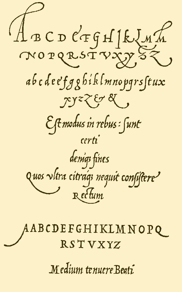
A page from Arrighi’s La Operina
By the mid 19th century, literacy had grown exponentially as a result of advancing technologies in printing and more widespread education laws. By the 1850s, America saw a rise in capitalism that resulted in an unprecedented need for scribes and scriveners to make copies of important business transactions. Needless to say, good penmanship was an invaluable and employable skill. Around 1850, Platt Rogers Spencer, “the father of American handwriting,” devised a new and revolutionary method of handwriting that was used throughout his chain of business schools.4

The new penmanship, coined Spencerian Script, was a flowing, ornate cursive intended to mimic the forms of nature. A poet at heart in the era of American Transcendentalism, Spencer wished his script to convey the ease and flow of the natural world while addressing the need for swift correspondence in a world that was ever speeding up. Spencer refined his instruction down to seven principles, which, if mastered, could combine to create a beautiful Spencerian hand. By the end of the 19th century, however, Spencerian script had fallen out of fashion in favor of a speedier, more efficient style of writing, but not before becoming immortalized in the Coca-Cola logo.

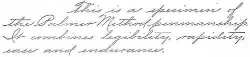
In the 1880s, in response to the demand for a faster, plainer, and more practical cursive, A.N. Palmer devised “The Palmer Method,” a standardized method of handwriting that became ubiquitous in the United States in the late 19th and early 20th century. This method proposed that handwriting should derive from automatic muscle movements and require very little mental effort.5 This automaticity is attainted through what many sign painters know as practice, practice, practice. I imagine the instruction of 19th century Palmer Method as a nation of steely-eyed nuns with wooden rulers pacing the classroom, watching eagerly for that wayward “O.”
A lesser-known pioneer of handwriting reform who also focused on the physicality of cursive lettering was the man whose words inspired the title of this art show. John Jackson was a British teacher of handwriting who believed very strongly in what he called “vertical writing,” a method of writing that lauded the connection between handwriting and “hygiene” (a word which, in Jackson’s usage, does not mean cleanliness but the virtues of proper posture). Jackson claimed that “vertical writing is the only specific for these abnormal postures and their train of disastrous consequences.”6 He believed that proper handwriting was a virtuous endeavor and could lead to benefits that reach far beyond a legible hand and decorous posture.
Though vertical writing had more of an impact in England than it did here in America, it must have seeped across the pond somehow because my own great-grandmother, Julia Maloney (1884-1947) of Lawrence, Massachusetts, was a proficient practitioner of vertical handwriting in her own right. Compare John Jackson’s signature with Nana Julia’s riveting 1900 letter to “Evelyn.”
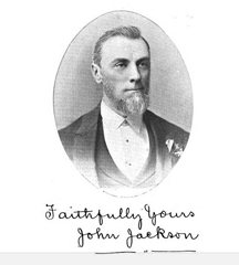
From John Jackson’s The Theory and Practice of Handwriting. 1896

Sample of my great-grandmother’s cursive writing, 1900
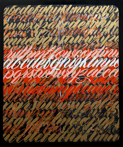
Kenji Nakayama, ABC Script, 2014
Graphology: “A Person’s Handwriting is a Photograph of their Character”7
With the introduction of Remington’s first commercially viable typewriter in 1873, handwriting’s status as the one and only method of quick, practical writing began to wane. But even as the typewriter became the go-to tool of writers and clerks, many transactions and literary endeavors were still conducted with pen and paper and there was still something about handwriting that intrigued both writers and readers. By 1960, when E.C. Matthews’ Sign Painting Course was published, the attitude of many ad-men of the time was that “the modern trend in signs is toward script.” Typewriters, after all, could not produce signs.
Matthews continues,
there is something especially attractive about a good piece of script lettering. It catches the eye, is easy to read and adds a graceful touch to the finished job. Signs are often too stiff looking even when the lettering is good. A word or two in script adds grace, swing, and the necessary curvature to make a good layout.8
Austin, TX sign legend Gary Martin agrees. He believes that script lettering “is beautiful when done right, it can ruin a sign when done poorly.”9 These judgments are derived from the aesthetic qualities of the letterforms and layout and can determine the success or failure of a sign. In the same way that we judge a sign (and by extension the business above which it hangs) the tendency to judge people based on handwriting seems engrained in our culture.
Though the new age movement has carried handwriting analysis into the 21st century, the 19th and early 20th century was the heyday of graphology (literally: the study of writing). In his 1919 graphological textbook, Graphology: How to Read Character from Handwriting, Hugo Von Hagen suggests, among other things, that “employers can, by studying the handwriting of their employees, guard against laziness, deception, gambling and dishonest tendencies, for an analysis of their handwriting will surely reveal these, if present.”10 What an invaluable tool for the interview process!
Von Hagen also suggests that “cruelty, brutality and animal instincts are expressed in angular handwritings, where all edges and corners of the various letters look like sharp, prickling thorns […] All cruel natures write thus.” 11 On the other hand, “persons who write very plain, pointed capital letters […] always have much love for art and the beautiful in nature; they see at once only the beauty and goodness of their environment before even noticing the unpleasant side.”12
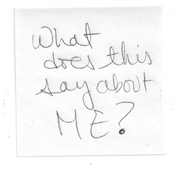
My very own handwriting, 2014
Edgar Allan Poe was a notorious proponent of the values of graphology, admitting in his 1840s study of marginalia, “for my own part, I by no means shrink from acknowledging that I act, hourly, upon estimates of character derived from chirography [handwriting].”13 George Orwell, too, famously pondered in his 1947 series “As I Please”: “it would be interesting to know whether there is any connection between neat handwriting and literary ability.”14

Cooper, Holy Shit, 2014
Access, Privilege, and Elitism
Despite graphology being overwhelmingly debunked as a reliable method of judging character, the tendency to judge academic ability based on handwriting has nevertheless prevailed into our current time. Both advocates and opponents of the continued instruction of cursive cite studies that suggest better handwriting results in better grades. Abigail Walthausen believes that “cursive has become a status marker” because of its classist connotations. As a high school teacher Walthausen observes that students who learned cursive in grade school (mostly those who came from Catholic or other private schools) are often the objects of envy by those who did not learn cursive (students who went to public school) and she considers this discrepancy of privilege unfair. She believes that “learning cursive is a basic right” and suggests that until computers are entirely integrated into both classrooms and standardized test settings, underserved students who do not know how to write or read cursive will be at yet another disadvantage.
Advocates of cursive handwriting do not opt for an either/or scenario, where students either learn cursive or typing skills. No one denies that typing is a necessary and extremely relevant skill in this day and age (obviously I’m typing this right now—it would be tedious and exhausting to write this by hand. In fact, it would be ludicrous). Most cursive advocates propose a comprehensive education that includes both cursive and typing. This solution is not practical, however, especially for schools in lower income areas that cannot afford to teach both methods. But it is in these lower income school districts where students are facing yet another level of discrimination based on their ability or inability to write in cursive. Rachel Jeantel’s infamous admission during the George Zimmerman trial, “I don’t read cursive,” was one of the many prejudices that people used to discredit her testimony and defame her character. If, as Walthausen suggests, cursive is a basic right, eliminating it from our schools or relegating it to elective classes will eventually make it a privilege, reserved for an elite society similar to the penmen who purchased Arrighi’s 1522 La Operina. The masses will not know how to write cursive, but perhaps more importantly, they will not be able to read it.
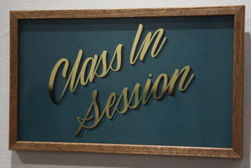
Will Lynes, Class in Session, 2014
Nostalgia and Authenticity: the Role of the Human Hand
Despite the scientific evidence that writing by hand helps students recognize and retain letterforms better than typing and that “cursive writing, compared to printing, is even more beneficial because the movement tasks are more demanding, the letters are less stereotypical, and the visual recognition requirements create a broader repertoire of letter representation,” the fact remains that cursive is just not practical or necessary in today’s world. But regardless of its practicality and relevance, the demise of cursive is regrettable because handwriting is still regarded as highly personal endeavor—one that connects many of us to our sense of self or individuality.
As an avid diarist, I’ve witnessed many changes in my own handwriting since I first started recording the events of my day in a Cabbage Patch Kids diary in 1984. Some of these changes occurred naturally as my pen tried to catch up to my racing adolescent thoughts and my writing became more fluid and less contrived. But some of the changes were deliberate, like achieving a unique but dignified signature, as I tried to cultivate a sense of who I was as a person and as a writer. Back then, computers were reserved for final drafts—you couldn’t bring your desktop to a coffee shop and brainstorm. You had to bring a notebook and some pens and freewrite your little heart out on paper, scrawling and scratching as you went, leaving with stained hands and callused fingers.
In her 2009 article, “Handwriting is History,” Anne Trubek agrees with the romantic and nostalgic sentiment that handwriting is connected to individuality, but brushes it off as mere sentimentality. She explains:
Handwriting slowly became a form of self-expression when it ceased to be the primary mode of written communication. When a new writing technology develops, we tend to romanticize the older one. The supplanted technology is vaunted as more authentic because it is no longer ubiquitous or official. Thus for monks, print was capricious and script reliable. So too today: Conventional wisdom holds that computers are devoid of emotion and personality, and handwriting is the province of intimacy, originality and authenticity.
Trubek explains that supplanting one technology with a more advanced method is historical and inevitable. She argues that the ousted method should not be romanticized but recognized for its usefulness in a specific time and place. She suggests that “what we want from writing […] is cognitive automaticity, the ability to think as fast as possible, freed as much as can be from the strictures of whichever technology we must use to record our thoughts” and that the writing itself, not the means by which it gets from the brain to the page, should be what’s important.
The anxiety surrounding the disconnect between body and machine is a sentiment that strikes a chord with many handwriting and sign painting advocates. Damon Styer, owner of San Francisco’s renowned New Bohemia Signs, suggests “that the more technology pervades every aspect of our lives, the more we feel a hunger for some semblance of human touch, some echo of our own softness—our own fallibility.” This reaction against the onslaught of technology is part of what’s fueling the resurgence of hand painted signs and for Styer, the role of the human hand is the key. Things made by hand convey a sense of authenticity and as much as we embrace and value technology for its role in making our lives easier, we know deep down that everything comes back to the human body.
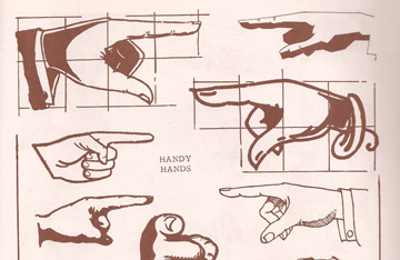
Manicule examples from E.C. Matthews’ Sign Painting Course, 1960
As I argue elsewhere, the link between authenticity and nostalgia is deeply rooted in our sense of mortality, which of course is linked to our sense of humanity or “fallibility.” Keypads and computer screens distance us from the letters that we produce and fail to convey an individualized sense of self as the letterforms are standardized into fonts that were created by someone else. Every time we delete a word instead of scratching it out, we’re forgetting our original ideas. Drafting on a computer is easier for sure, but it can’t be denied that something human, something authentic or original, is being lost.
Many commenters on the online articles I’ve cited in this essay point out that future generations will not be able to read the Declaration of Independence and other historical documents that are written in cursive. They will have to rely on transcriptions and trust that the transcribers got it right. Limiting an education in cursive limits access to primary research and it also limits access to our own genealogical histories. The Declaration of Independence and other important historical documents have been or will be transcribed and digitized, but my great-grandmother Julia’s letters will not be. And my teenage journals and diaries will not be. The beautiful script signs in this show will be undecipherable, except by an elite few. The stunted sense of history that will accompany the elimination of cursive handwriting is lamentable.
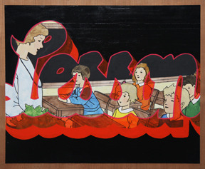
Corinna D'Schoto, Lesson, 2014
Is Art the Answer?
But cursive handwriting will survive, if only on the fringes. Anne Trubek suggests that the teaching of cursive be relegated to art departments and its virtues celebrated as are other fine crafts. She claims that traditional trades such as letterpress and stained glass (we could insert sign painting as well) “have a life beyond nostalgia.” Existing and thriving beyond nostalgia is the mission of the Pre-Vinylite Society—if a reverence for the past is nothing but wistful melancholy for a bygone era then there is no hope for the future. In order for traditions to endure, they must be carried forward and entrusted to the next generation.1
Despite its continued delegation as a “lost art,” sign painting has recently seen something of a renaissance as business owners and the general public begin to recognize the value (and perhaps the virtue) of the trade in our technological world of immediate gratification. The trend towards a slower way of doing things is catching on in many fields, including the culinary arts and alternative medicine. Just as the idea of a sign painting art show would have seemed absurd to the practitioners of the trade before the last decade or so, I’m confident that cursive lettering will see a revival in the coming years as more handwriting advocates push past their romantic, nostalgic tendencies and make an effort to bring traditional skills into the future.2
1The International Association of Master Penman and Teachers of Handwriting (IAMPETH) is an organization dedicated to the preservation of cursive handwriting and calligraphy. For more information on their mission and resources, visit their website at iampeth.com
2The earliest recorded exhibition of signs was in London in 1762. Its purpose, however, was not to celebrate the signs as works of art in and of themselves but to ridicule them satirize the very novel idea of exhibiting art. The 1762 Grand Exhibition of the [fictional] Society of Sign Painters will be the subject of an upcoming Pre-Vinylite Society art show that I plan to curate in the near future. Stay tuned!
Notes
1John Jackson, The Theory and Practice of Handwriting: A Practical Manual for School Boards, Teachers, and Students, with Diagrams and Illustrations (London: Samson Low, Marston & Company, 1896), viii.3 Kitty Burns Florey, Script and Scribble: The Rise and Fall of Handwriting. (Brooklyn, New York: Melville House Publishing, 2009), 39-40.
4 Ibid. 63
5 Ibid. 75
6 Jackson, The Theory and Practice of Handwriting, 15.
7 Von Hagen, Hugo J.: How to Read Character from Handwriting, a Textbook of Graphology for Experts, Students, and Laymen. (New York: Robert R. Ross, 1919), 1.
8 E.C. Matthews, Sign Painting Course. (Chicago: Nelson-Hall Co., 1960), 35.
9 As quoted in Colt Bowden’s “How to Paint Signs and Influence People: Script Lettering, Vol. 3,” (2013).
10 Von Hagen, Graphology, 2.
11 Ibid. 52
12 Ibid. 55
13 Edgar Allan Poe, “Marganalia—Eureka.” The Complete Works of Edgar Allan Poe,Volume 16. Ed. James A. Harrison, (New York: Thomas Y. Crowell & Company,1902), 19.
14 Orwell, George. “As I Please.” Manchester Evening News for Tribune. 28 Feb. 1947.

