ornafives asked: Hi there, my names Tom and I'm an illustration student! I really like your stuff and really like the colours you use, I was just looking for some advice on how you pick your colours - do you have a method or do you just choose what you think will look good at random? Thanks :-)
In a very general way, I always keep an eye out for colors and combinations of colors that are striking. Right now, for instance, I’m doing a comic and the colors are based on “Lune L'envers” by Blutch.
Even if you’re just doing a single image that isn’t part of a comic I think the below principles still apply. Now, since I mostly do comics stuff, that’s how I think about color, so forgive me if this doesn’t answer your question as directly as it should.
I’m usually thinking about a few things when I color. I want a comic book spread to be visually striking and coherent, even at arm’s length. So I think a lot about finding colors that (1) articulate the “structure” of a page, (2) communicate the emotional thrust of the narrative, and (3) clarify the fictional spaces in the drawings. “True” or “natural” color is only used as a loose touchstone. Here’s an example from two comics that I have available at the moment:
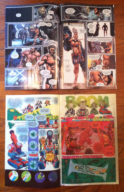
It’s a little unfair to compare these two since they are shooting for such different goals, but I still think they can help illustrate what I’m talking about. The bottom spread is vastly more exciting and visually appealing. It’s from Transformers Vs. G.I. Joe #2, written by Tom Scioli and John Barber, with all the art and lettering by Tom. Should I mention the credit on the top one since I’m going to talk shit about it? I don’t know. I don’t even think there’s anything particularly bad about the top spread (well except for that drawing of Storm. That is truly awful) its just kind of a standard superhero spread.
While Scioli blocks out areas of the composition with bold colors that highlight the fun adventurous tone of the story, the top spread is chained to “real colors” and ends up just being kind of a big brownish blue blob. Colors being bright isn’t a requirement (although I think it helps a lot of the time) but unless the story requires a murkiness then there isn’t a reason to color something the way that top spread is colored. I think, even if Scioli’s spread was desaturated some the coloring would still be much more effective than the top comic.
Really, Scioli is just pushing harder and thinking about the pages as a whole. He colors in dialogue bubbles to reinforce composition on the left page, and to maintain visual intensity in the red panel on the right page. He uses a lot of colors in some areas, like the tall panels on the left page, but offsets that by using the same colors in other areas through out the page.
In the top spread, if the room is a dark grey blue in the 2nd panel, it’s colored that way in all the other panels. Same with Wolverine’s skin tone. It isn’t necessarily bad (sometimes it works to do a section of a story with a really limited palette, for example) but the whole comic is colored in a really restrictive way.
Anyway… I could go on forever about this stuff… I’m really interested in learning about coloring and improving my work.
robartgoldman liked this
deepspiration reblogged this from mattsheean
randeepk liked this
liamcobb liked this
grimwilkins liked this
thelandofmonsterscomics liked this
raindropouts liked this
zachhazardvaupen liked this
anujink liked this
realmsofsleep liked this
lazarusmeteor liked this
bensears liked this
theoceanprimordial liked this
 willtempest liked this
 mattsheean reblogged this from malachiward
 clock-monster liked this
 cogcomics liked this
alchemichael liked this
i-perm liked this
jessebalmer liked this
 aidanquinlan liked this
 snakeoily liked this
cascadingfailure liked this
benhumeniuk liked this
nicholevanbeek-blog liked this
gabrielverdon liked this
lost-in-line liked this
pb-and-paint liked this
noodleverse liked this
cesarsebastian liked this
zepangborn liked this
jakewyattriot liked this
fordathomas liked this
50shadesofmyblackass liked this
malachiward posted this