Newsaesthetics do visualisations (poorly)
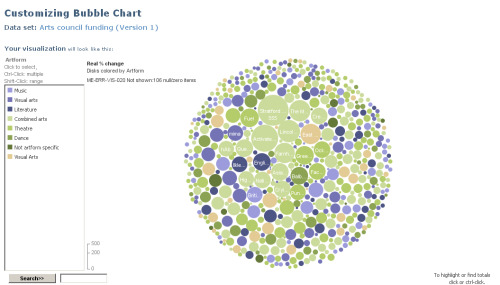
After many, many aborted attempts at conjuring up a visualisation, I was gifted a data set about arts council funding this morning via the Guardian’s datastore and managed to piece together this little bubble chart on Many Eyes. It works a bit like a pie chart, only prettier and more flexible. Basically each individual bubble represents an institution (e.g. The Royal Opera House). The size of the bubble represents the % change in funding from the previous year. The colour of the bubbles corresponds to the art form - a forest green for theatre, sea blue for music. Lovely isn’t it.
Is it useful?
Well, yes and no. The main problem is that it doesn’t represent cuts in funding very well - the negative percentages are just smaller bubbles. I’m not sure if it illustrates the number of institutions that have received cuts either, because all the bubbles are different sizes. Don’t think David McCandless is going to come knocking any time soon, although it is a lot more interesting than staring at a spreadsheet…
Posted by Ben