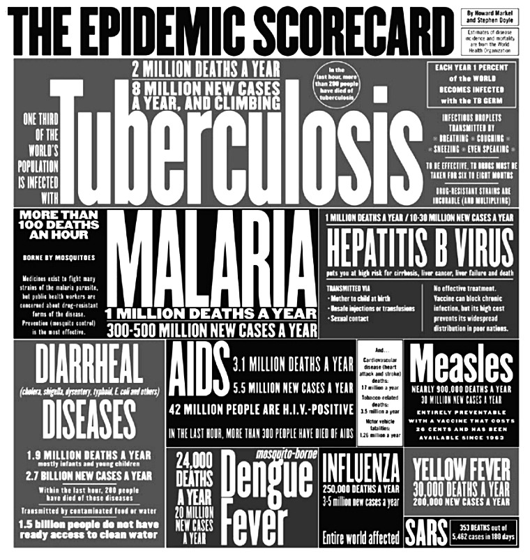
I stumbled onto this wonderful typographic piece in a vaccine lecture today. It’s a series of “sample” headlines developed this for the New York Times with numbers from the WHO. It’s a few years old (thus, the now defunct SARS) but its quite a powerful graphic. AIDS is dwarfed by scale and scope of all the epidemics with TB topping the chart at 1/3rd of the entire world population infected with TB. The graphic was developed by Stephen Doyle who’s design studio creates products ranging the iconic logo for Martha Stewart to the cover art for the Pat Metheny Group albums.
plastic-mountains reblogged this from hfjc-blog-blog
hfjc-blog-blog posted this