A Creative Review: The Dark Knight Rises
Welcome back to A Creative Review with James Cooper. Today Coop critiques one of the fantastic promo billboards for Christopher Nolan’s The Dark Knight Rises.
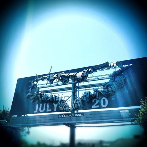
Photo credit: Rob Sheridan, via Instagram
Talkability
Will people talk about this billboard? Of course they will. Ok, you have a rabid fan base that is just waiting for any Batman related content - but still there is an epicness (if that’s a word, spellcheck seems to think not) about this that would work even if people weren’t nuts for the Dark Knight.
Six characters
Holy editing Batman! We talked about trying to keep text to a minimum with the mini ad last time. This does that brilliantly. Six words? Nah, try six characters.
Destruction
There have been a lot of billboards destroyed for effect so this is nothing new, but I like the bat shape. It draws you in and is not gratuitous. There is a reason for the destruction. It’s always great to see a bit of sky in the middle of a billboard. I just think it makes people do a double take.
Energy
This is an ad for a film. A moving image, a highly polished moving image that is super-fast high-paced adrenaline pumping non-stop! It’s hard to capture that on a flat piece of board. Yet this has all of that energy. In your mind you visualize a giant bat ripping this board to shreds and streaming down the highway. Crap, I really need to go see this movie!
_____
That’s all folks! Want to get involved? Send us the best or worst billboards you’ve seen and we’ll choose one every week. Just email coop@adstruc.com.