
At least one graduate of Yale liked my GSU logo, so I decided to make a similar wallpaper for a member of the Ancient 8-bit. Enjoy!
If you want me to do your college, let me know.
At least one graduate of Yale liked my GSU logo, so I decided to make a similar wallpaper for a member of the Ancient 8-bit. Enjoy!
If you want me to do your college, let me know.
See more posts like this on Tumblr
#Yale #8-bit #iPhone Wallpaper #tjvonp illustrations
In a few days, I will be graduating from GSU, so it’s about time that I share this wallpaper. I made it a couple of years ago to use on my desktop, but this version is sized for an iPhone 5.
Later this month, I might be taking my second trip to Canada. If it happens, it will only be my second time out of the country, and I am hoping that this time I’ll get time to do more than think, “Oh, wow, the squirrels are a different color on this side of the river,” and, “Geez, our waterfall sucks.”
In celebration of this, the least significant of all possible trips abroad*, I decided to reboot an honor I bestowed to America a few years ago and make a vector illustration of Canada’s flag that exactly matched it’s color and geometric specifications. You can see the result above.
This go-around wasn’t quite as satisfying as last time. Whereas constructing the American flag required lots of precise measurements of ratios (”Okay, so this is the space between the stars, relative to the canton, relative to the stripes, relative to the hoist, relative to the…”) and lots of careful color considerations (”Should it be relative, absolute, or Pantone?”), Canada was dead simple. The flag is a 2:1 to one rectangle. The white portion is a square in the exact center. The red is pure red, the white pure white.
Now, the leaf presented a little difficulty, but in the end, I just cleaned up the vector that was featured on Wikipedia, because I could not find any instructions on how to perfectly construct it from scratch.
Before I gave up and went with that cheap route, I stumbled across the Great Flag Debate of the 1960s, and wow, what a time to be alive. Apparently the main proponent was a Nobel Peace Prize winner who was more than a little upset when Canada was trying to keep the peace in Egypt during the Suez Crisis and Egypt was like, “Nuh uh, you’re on Britain’s side, you’re flying their flag.” And yeah, they kind of were.

Look at that big ol’ Union in the corner!
So, then Canada had this long argument, and people got pretty fed up with eachother, but there were two things people could agree on:
1. 80% of Canadians didn’t want another country’s flag to represent Canada.
2. 60% of Canadians wanted a maple leaf on their flag. Yeah, that’s right. That simple and silly (and iconic and endearing) symbol was a more popular choice in Canada than… I don’t know, pick just about any political stance, and it’ll be less popular than Canada’s flag.
So, here are the three flags the Special Flag Committee settled on:
Oh, come on, SFC, you had one job! Get that Union Jack outta here!
“Yeah, one leaf is nice, but you know what’s nicer than one? Three. It’s 300% nicer. Also, flags have to be red, white, and blue, right?”
Ah, here we are! This flag was chosen by a sizable majority of Parliment on December 15, 1964. It was updated the next year to a slightly more modern form, but this is the flag we all know and love, or at least all know and recognize as Canada.
So now you know a bit more about l'Unifolié (”the one-leafed”). Promise to use this knowledge only for good. As for the flag itself, use it for whatever you want, since there are no laws saying what you can do with it.** Come back next week for another edition of “Ty Takes You Down an Internet Rabbit Hole.”
*I mean, it’ll be to Quebec where they mostly speak French, so that counts for something, I guess.
**As far as I can tell (read: as far as I can tell after a ten second search on wikipedia), there are not any actual legal penalties for doing stuff to the American flag, and the laws that are in place are not really enforced.
And just for fun, here’s a pixel-y flag.

Oh, hey, another logo pixelized. Enjoy!
See also: Georgia Southern University and Yale
tumblrbot asked:

This is a false dichotomy.

beep bop boop

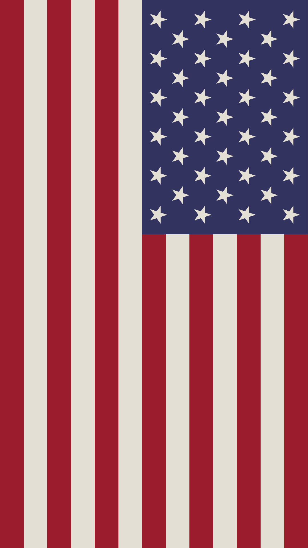
I don’t usually do much to celebrate the 4th of July, but I’m in a holiday mood right now. Hence, flag wallpaper.
I made this in Illustrator following the guidelines laid out in Wikipedia’s article on the flag.
Oh, hey, I made this last year. Enjoy!
Oh, hey, I made this two years ago. Enjoy!
There has been a lot of talk about flags and their significance lately. Even before the big controversies and celebrations, people were talking about what makes a good flag:
The American flag is a beautiful example of each of these. …well, one could argue that those 50 stars aren’t the most “simple“ design. Ask a child to draw a US flag, and I bet the canton would devolve into a nebulous mess. One could argue this, but I certainly won’t.
Turns out Tumblr has strange size restrictions I didn’t know about, so to put this up full sized, it has to be vertical. My mistake!
The original post is here.
I don’t usually do much to celebrate the 4th of July, but I’m in a holiday mood right now. Hence, flag wallpaper.
I made this in Illustrator following the guidelines laid out in Wikipedia’s article on the flag. Obviously, I had to cut off the edge to make it fit, but I have a full version.
Let me know if you decide to use it or put it somewhere else! :D
EDIT: Turns out Tumblr has size restrictions that make it impossible for me to put the 1920x1080 flag up without it resizing to 1280x720. If you want it in the original size, go here and rotate the image.
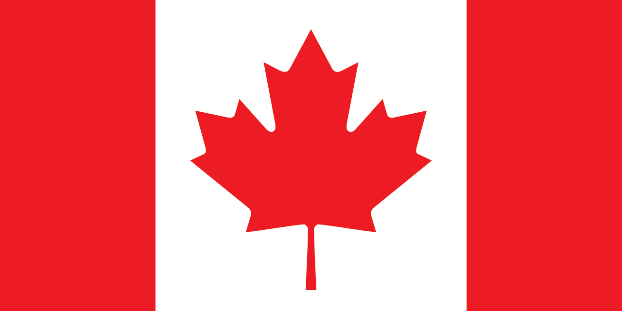
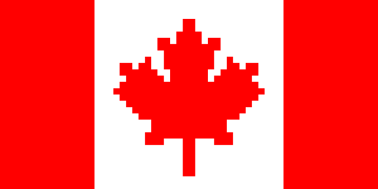
Later this month, I might be taking my second trip to Canada. If it happens, it will only be my second time out of the country, and I am hoping that this time I’ll get time to do more than think, “Oh, wow, the squirrels are a different color on this side of the river,” and, “Geez, our waterfall sucks.”
In celebration of this, the least significant of all possible trips abroad*, I decided to reboot an honor I bestowed to America a few years ago and make a vector illustration of Canada’s flag that exactly matched it’s color and geometric specifications. You can see the result above.
This go-around wasn’t quite as satisfying as last time. Whereas constructing the American flag required lots of precise measurements of ratios (”Okay, so this is the space between the stars, relative to the canton, relative to the stripes, relative to the hoist, relative to the…”) and lots of careful color considerations (”Should it be relative, absolute, or Pantone?”), Canada was dead simple. The flag is a 2:1 to one rectangle. The white portion is a square in the exact center. The red is pure red, the white pure white.
Now, the leaf presented a little difficulty, but in the end, I just cleaned up the vector that was featured on Wikipedia, because I could not find any instructions on how to perfectly construct it from scratch.
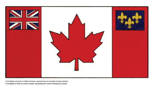
Before I gave up and went with that cheap route, I stumbled across the Great Flag Debate of the 1960s, and wow, what a time to be alive. Apparently the main proponent was a Nobel Peace Prize winner who was more than a little upset when Canada was trying to keep the peace in Egypt during the Suez Crisis and Egypt was like, “Nuh uh, you’re on Britain’s side, you’re flying their flag.” And yeah, they kind of were.
Look at that big ol’ Union in the corner!
So, then Canada had this long argument, and people got pretty fed up with eachother, but there were two things people could agree on:
1. 80% of Canadians didn’t want another country’s flag to represent Canada.
2. 60% of Canadians wanted a maple leaf on their flag. Yeah, that’s right. That simple and silly (and iconic and endearing) symbol was a more popular choice in Canada than… I don’t know, pick just about any political stance, and it’ll be less popular than Canada’s flag.
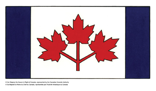
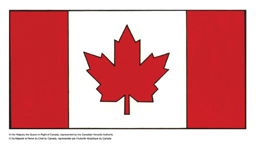
So, here are the three flags the Special Flag Committee settled on:
Oh, come on, SFC, you had one job! Get that Union Jack outta here!
“Yeah, one leaf is nice, but you know what’s nicer than one? Three. It’s 300% nicer. Also, flags have to be red, white, and blue, right?”
Ah, here we are! This flag was chosen by a sizable majority of Parliment on December 15, 1964. It was updated the next year to a slightly more modern form, but this is the flag we all know and love, or at least all know and recognize as Canada.
So now you know a bit more about l'Unifolié (”the one-leafed”). Promise to use this knowledge only for good. As for the flag itself, use it for whatever you want, since there are no laws saying what you can do with it.** Come back next week for another edition of “Ty Takes You Down an Internet Rabbit Hole.”
*I mean, it’ll be to Quebec where they mostly speak French, so that counts for something, I guess.
**As far as I can tell (read: as far as I can tell after a ten second search on wikipedia), there are not any actual legal penalties for doing stuff to the American flag, and the laws that are in place are not really enforced.

.svg)