
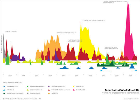
A takedown of David McCandless by Stephen Few
Too many of his visualizations display information in ways that hide much that’s relevant and essential, leaving little of value for the viewer to see. McCandless rarely chooses forms of display that our eyes and brains can perceive with ease and precision. He selects what will appeal superficially to the viewer (lots of circles, swirls, and vibrant colors), not what will most effectively express what’s essential and meaningful. His displays rarely draw viewers into the data in a thoughtful way, but entertain in a way that delivers a simple message, which is often anemic when compared to the richer, subtler, and more complex stories that live in the data.
McCandless is a creator of infographics: combinations of words and graphics that are designed to communicate specific messages. On those rare occasions when his infographics lend themselves to data exploration and analysis, they do so in limited and awkward ways, asking viewers to perform data surgery with blunt instruments. Infographics of this type attempt to tell a story. In McCandless’ case, the stories that they usually tell, if communicated in words alone, would require only a short sentence or two. They make a simple statement in a way that looks lighthearted and fun. As such, they invite viewers to accept the message superficially, not to explore or contemplate deeply. This is not the true realm of analytics.
Emphasis mine. I’ve been thinking lately about how many “infographics” I see would be so much more easily summed up by a single sentence or two.
I’m suddenly reminded of my friend Jessica Hagy, and her wonderful venn diagrams, Indexed, and how she constructs them: she starts with sentences and word equations and breaks the verbal grammar into the visual grammar of charts – she actually breaks down the meaning of the sentence in order to construct the puzzle of her charts…
Of course, the argument for infographics like this, I would think, is that the color and aesthetic pulls the viewer in, and the deciphering process actually forces them to spend more time with the information…kind of how recent studies have shown that bad fonts that have to be deciphered lead to better memory retention.
There is strong theoretical justification to believe that disfluency could lead to improved retention and classroom performance. Disfluency has been shown to lead people to process information more deeply, more abstractly, more carefully, and yield better comprehension, all of which are critical to effective learning.
These are the things I think about at 1:13 a.m. on a Friday night.
 betzistar