
Scandinavian Grays - Part I
This is Part I of a series on Scandinavian grays - images I took in Scandinavia of grays used in different ways on different materials. The real thing! I hope it is inspiring.
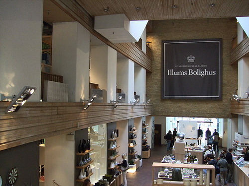
Above: Rich, dark, gray sign, against lighter and warmer shades (image by Susan)
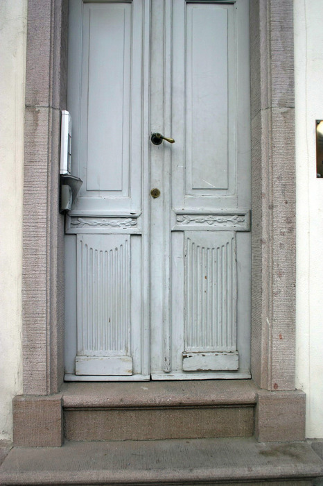
Above: Here it looks more blue than gray because it’s against a warm shade. With a bluer blue next to it, the door would appear very gray (image by Susan)
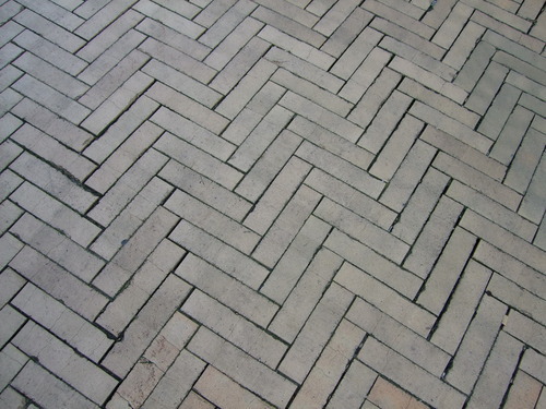
Above: Who doesn’t love the herringbone pattern? (image by Susan)
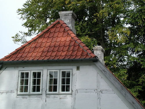
Above: Ever so soft gray… (image by Susan)
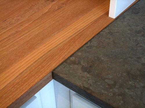
Above: Seems to be a more gray/brown shade (image by Susan)
Above: That deep, rich, tint-of-blue gray is just beautiful (image by Susan)