Pinterest, the design pattern to end all design patterns
So, as we all know, Pinterest is blowing up like the fourth of July. Similarly, so is Fab. What’s the secret to their success? It’s their design pattern.
You know, the thumb grid. The thumb grid and nothing else. This pattern sets off such a euphoria in users, I’m shaking my head as to why us web people didn’t put it together sooner.
My assumptions on why this pattern works:
- People don’t want to read
- People love photos
- Most importantly: People love thumbnail grids because it breaks from a linear pattern of consumption.
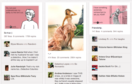
Linear Pattern of Consumption
In a grid, you can dart side to side, top to bottom to consume the same amount of information as you would by viewing everything in a straight line. But there’s one key difference. When you move in such an erratic pattern, your brain can’t remember if it’s consumed all the content. What this means is that you can never mark a page, or, more importantly, a section of time, done.
A section of time? When you go on facebook or twitter, you check to see what you’ve missed based on a section of time, usually since the last time you signed in. You usually remember the last post you saw, and then move through the timeline until you’ve consumed all posts after the last. Then, your brain marks it done. You close the window. You want to return. (How many times have you closed facebook and immediately opened a new tab and started typing “facebook.com?” How many?) But you stop. You know you’ve seen all there is to see, and you know that to see a fresh burst of content, you must wait.
But oh no, productivity be dammed, I want more photos. I need more cats. Enter the thumb grid. Linearity is gone. Your brain tries to mark what is consumed/not-consumed, and but eventually it gives up. There is no done. There is no mercy. And no matter what, when you want to log back on, there’s always going to be something new, and a lot of it.
A smattering of screenshots to hammer this home:
Fab

Punchfork

Discover.Usabilla.com

Desktime.com

One last thing
They also did away with something I’ve suspected has been worthless for a long time: sidebars.
For example(from nytimes.com), no one is paying attention to this:

Full disclosure: Fab.com is a customer of my employer, RJMetrics.
1 Notes/ Hide
samlinks reblogged this from mattmonihan
mattmonihan posted this