Bojack Horseman S03E08: Old Acquaintance
More you might like
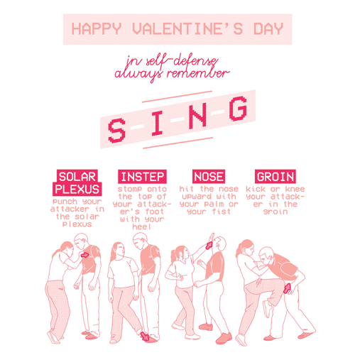
GIF artist Faye Orlove made these beautiful valentines for you! For a downloadable sheet that you can print and share with hot babes, GO HERE*
*(if you’re not viewing this from the Tumblr dashboard, hover over the image “source” link)
I am playing Pokemon Go since they are out in Germany. I visited few most popular PokeStops in city, and it looks like some trainers need more warnings beside being aware of surrounding
there is literally no meme popularity rising time frame anymore.
it used to be you could go days without seeing a meme on your dash, and only learn about the meme from other users or see variation memes reblogged before seeing the original meme post.
there’s no wait time anymore, no meme priming.
a meme happens and the second tumblr figures outs it’s popular, they start churning out variations as fast as they can, filling up dashes not only with new variants, but with the half a dozen of the same post in a row, because everyone you know sees it at the same time and reblogs it immediately.
no wonder so many memes burn out in a matter of days, you’re working these poor memes into the ground.
you’re burning the meme at both ends.
we live in a throw-away meme society
why invest in a long lasting meme when mass production makes them cheap and disposable
Don’t get my girlfriend to ask me for free tickets if you’re going to ditch her, you pieces of shit.
So one of my best friends from my freshman year of college is a bouncer at a popular bar on campus, and once in a while, if there’s a concert I like, he’ll set aside a few free tickets for me (as long as I let him know in advance, and usually I pay him back with drinks, food, whatever).
My girlfriend is a major Skrillex fan (eh, whatever. I like EDM, but I don’t like that “bro-y” kinda dubstep). It turns out a couple of her “friends” in class were too. So she asked me if I could get my friend to give her and her friends four tickets. I was wary, because I didn’t know these chicks and they looked bitchy, but I trusted her judgment. I talked to my friend, got the tickets, and gave them to my girlfriend.
It turns out that my girlfriend trusted these bitches too much, because she gave them the tickets to hold on to, since one of them was going to drive everyone (you could use the bus system, but this was FEBRUARY, and it was too cold to wait outside).
Naturally, shit goes South, and my girlfriend is calling me crying a few hours before the concert, saying that the girls just ditched her and decided to bring a different friend instead. Now, I was driving home for the weekend, but as soon as I heard this, I called my dad and told him I’d be a day late. As soon as I explained the situation, he laughed, because he knew I was going to do something or the other in response.
I called my bouncer friend an hour and a half before doors opened, once I’d reached campus again. I let him know about the situation, and since these tickets were those “print out and scan the bar code” kind, he just cancelled those four tickets, and actually printed out two new ones specifically for me and my girl (I picked them up myself, and he told me he’d kick my ass if I let anyone have them this time).
My girlfriend was so excited when I told her this, and we both quickly got ready (well… I quickly got ready). We showed up right as the doors were going to open, ready to hear a bass drop so sick it would make ebola seem like a cold. As we showed up, there was naturally a long as hell line, and luckily, about twenty people in front of us were those bitches.
As soon as the doors opened, they started letting people in, scanning tickets, and checking IDs. Once the bitches were getting their tickets scanned, the bouncer (my friend) saw from the error that these were the tickets that were the ones stolen. He saw me a little bit behind, and told them to wait on the side while he let in the next few people.
After the next ten people, they start whining and complaining that they should be let in because they’re going to lose good spots. He tells them there’s an issue with their tickets, and once my girlfriend and I show up, they immediately shut the fuck up and their faces turned really white. He scans our tickets, says to them “Oh look, these were the tickets you girls wanted, weren’t they?” and they just stormed out of line, pissed as hell.
As they left, I yelled “if you want, you can just sit by the walls and feel the bass from there!” (I was kidding, but honestly, Skrillex uses way too much bass for my taste. Holy shit, my heart was shaking during that concert.)
TL;DR some bitches tried to use my girlfriend to get free tickets out of me, so I fucked them over and enjoyed a wub wub concert (and yes, my dad had a great laugh when I went home the next day).
I love playing Brienne of Tarth because, when I was growing up, I didn’t really see people on television that I felt that I could identify with. Women all looked kind of a particular way, women characters that were popular, anyway. And when I had the opportunity to play this part, it made me explore the parts of myself I had hidden from. I had very long hair. I wanted to look very feminine, really tall. (x)
#recast gwendolyn christie as wonder woman 2k14
So here’s my tip of font using in graphic design. I made this list of fonts I suggest to be used more often and fonts I suggest to be used less often. Especially from Helvetica to Gill Sans, they are really popular fonts to be used by professional designers. They all work finely whether in graphic design, web design or typography.
From Rockwell to Parisish, they are fonts to be used in typography or artworks, mostly for vintage style. They are probably not suitable in some formal occasions. But they will be your good choice when you want to make a fancy coffee shop banner.
You might be surprised that Arial and Times New Roman are in my less used list. But don’t stop using them in your homework and essay- well, now you probably understand why you shouldn’t put them in your graphic works.
The rest of the fonts are what I constantly see people using in their graphic works and I must say that even tho those fonts look cool and fancy, they actually don’t look as quality as you think.
BUT, that doesn’t mean you should delete these fonts from your computer (oh but delete Comic Sans for God’s sake) They can still be used for certain situation, as long as you handle them well. However, please never do something like using Colors of Autumn as the title and Typewriter as the concept, unless you’re trying to drive someone crazy.
whoever made this clearly doesn’t work as a graphic designer or this list is almost 5 or 6 years old and was made like the week after hf&j (rip) released archer and it needs to be updated because if i see one more god damn thing done in archer i’m going to puke. archer is the new comic sans. that fucking font was beautiful and great and i loved it and then everyone and their god damn mom jumped on top of it and used it for everything and destroyed it.
if a font could ever go viral, it’s archer. archer is the avocado green appliance of the font world. archer is the beehive hairdo. the acid washed jeans. it was too trendy for its own good and when you see something done in archer, it’s SO FUCKING DATED. which is a straight up tragedy because the font is less than 10 years old and BEAUTIFULLY designed. but when WELLS FARGO did their brand in archer and MY LOCAL FUCKING NEWSPAPER redid their brand in archer…. it jumped the shark. i still mourn that font. it was so great, and you killed it. you blew it up.
and if you can HONESTLY explain to me why helvetica is better than arial, we’ll talk. because everyone “knows” this, but no one seems to know this. and let’s be honest. helvetica’s capital R is garbage and arial definitely wins on that one. but seriously. if you can, without looking it up, tell me why arial is bad, then i’ll allow you to keep this on your list. tbh i don’t even use either of these fonts, lato is far superior to both.
and wow, really, it’s 2014, are we still doing the OMGLOL COMIC SANS IS BAD thing because yeah, i get it, you know everything about typography because you hopped on an eight year old bandwagon and are still beating this dead horse *slow clap* good for you, you know ONE font that BY THE WAY ISN’T EVEN THAT BAD THE ONLY REASON IT IS THE BANE OF ANYONE’S EXISTENCE IS BECAUSE IT’S SO MISUSED. someone talking shit about comic sans is a red flag that this person a) is a freshman art student who just took a couple design classes or b) living under a rock and thinks it’s still 2006.
this whole list reeks of “art student” with no real-world design experience. there’s nothing wrong with art students, they just don’t really have the knowledge to comment on current trends in the industry and that is extremely obvious in this terrible roundup of fonts.
there are so many problems with this list. almost ALL of the “recommended” fonts are fonts that need to not be used anymore because they are so over done. avante garde needs to go. it’s played out and over used.
trajan and trajan pro? unless you’re making a poster for star wars episodes 1-3, try again. there’s hundreds of thousands of beautiful serifs out there, just waiting for you to discover them.
i cannot think of any wide use for riesling, why the hell is that on here? in fact, most of the display fonts on this list shouldn’t be on the list. they’re all situational at best and shouldn’t be “used more”.
georgia is a screen font, it shouldn’t be used in print design, though i suppose digital applications are by and far the majority of work being done these days, i just wanted to clarify this since this font is NOT great in print.
you want to talk about fonts that actually need to stop being used? aside from archer, because god damn yall fucking ruined that one.
let’s put curlz mt on there. this font is terrible on all fronts. terrible letterforms, terrible kerning, terrible terrible terrible.
scriptina. every motherfucker uses scriptina when they want their font to look elegant. guess what. THIS IS THE WORST SCRIPT FONT EVER MADE. if you use this font, you have automatically ruined whatever you’re doing. every artist and photographer using this font needs to just stop, back away, and try again.
bleeding cowbow. oh my god. burn it with fire.
lucida hand, kristen itc, bradley hand itc — more terrible handwriting fonts that are over used and not good fonts.
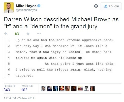
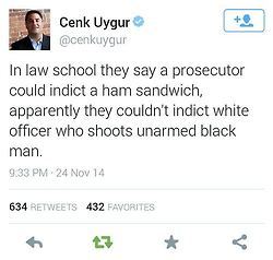
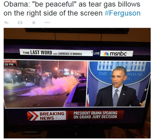
Ferguson master post
Note: This includes many Tumblr posts, however, they are mostly resource pages with links to articles or are video/photo evidence. Feel free to add anything I may have missed.
Here is an inclusive chronological list of what has happened, mostly from neutral POV.
Every piece of evidence used in the case.
A post countering a popular Facebook repost.
Here are a few other master posts.
A blog dedicated to Mike Brown
"Brown robbed a store and Wilson was responding to it!":
- Owner of store says no one called the cops on Brown
- Chief officer says Wilson did not know about the robbery
- This video shows Brown paying for the items he “stole”
- Here’s another link showing the same thing
"Brown tried to take Wilsons gun!" "Brown Punched Wilson!" "Brown charged at Wilson!":
- Autopsy shows there was no struggle
- Eye Witnesses account of what happened
- Forensic evidence disagrees with the idea of Brown charging Wilson
- All key details of eyewitnesses agree with each other but not Wilson
- Brown did not reach for Wilson’s weapon

"Brown was only 30 feet from Wilson when he charged him!":
"Wilson was badly injured by Brown!":
- Explanation of medical terminology used to describe Wilson’s “injuries”
- Supposed Orbital Blowout debunked
- Wilson’s side of the story nearly impossible
- Images of Wilson’s “injuries”
"The protesters are all thugs and thieves who are destroying Ferguson!":
- Community cleaning up damage from riots
- More clean up compilation
- Livestreams of protests
- Ferguson Riot Police open fire on protesters
- Cops fire tear gas at group helping a woman who had a heart attack
- List of riots caused over nothing
- Another list of riots over nothing
- Hundreds of protesters sitting silently outside Ferguson police station
- Police tear gas protesters inside of coffeehouse
- Man standing in front of police vehicles
- Artist and protester helps community make city beautiful
- Youtube playlist of riot police attacking people, specifically reporters
"Wilson is a good cop!":
- Darren Wilson violating 1st amendment rights of citizen
- Darren Wilson roughing up drug suspect
- Christopher Brooks Arrest Report
- Darren Wilson racially profiling well before Brown
- Darren Wilson’s first job was on a troubled police force that was disbanded by authorities
- 15 questions about how Wilson handled the situation
"The police said _____!":
- Ferguson Chief caught in huge lie
- Police force more than 90% white while population more than 50% black
- Police Lied about how far away Brown was when he was shot
- STLPD keeps changing their story
- Cop falsely accuses protesters of firing guns causing gas attack
- Police Lied again
- Police chief lied about why he released the tape of Brown “stealing”
- Darren Wilson got married for special rights
- Officer Go Fuck Yourself speaks for himself
- Wilson’s contradictory statements
- Police harassing a family of 5 before breaking the window for not wearing seatbelts


"They burned a flag, that’s illegal!":
"The decision not to indict was fair":
"This is not a race issue!":
- Other similar cases
- Timar Rice, 12, killed while on a swing
- Issues with the Brown case
- List of black people killed by police


Now get out there and destroy some racist assholes!
Edit:
Some interesting news.
There’s a blizz press event on the 5th of august (Gamescon period) and invited is a very popular WoW french website. The last time blizzard’s done something like this was 2013 Gamescon where they invited D3 people and announced Reaper of Souls at a press event.
D3 just got 2.3
Hearthstone just got new expac
Legacy of Void just got newer stuff
Overwatch isn’t in beta yet
We could be seeing some form of WoW announcement.

The short answer:
Fanart and pinups.
The long answer:
What exactly are you after? I’m not being snarky or facetious, I am asking out of genuine curiosity, because what your priorities are makes a big difference to my advice as to how to approach your Tumblr. Is your ultimate goal to get the most followers? What will that achieve for you? Are you aiming to feel popular, or to improve as an artist? The two don’t necessarily go hand-in-hand. As you are Anon I can’t have a back-and-forth with you, so I will guess some probable motivations and give my 2p (US$0.03) on them:
