99% Invisible is a tiny radio show about design, architecture & the 99% invisible activity that shapes our world. New episodes every Tuesday on 99pi.org. This is just the tumblr.
Starlee Kine’s friend Noel works in advertising. In 2003, Noel was working in at an agency in Richmond, VA. Everyone wanted to work on flashy spots like Apple or Nike or Gatorade. Do you know what wasn’t flashy? Insurance. Which is why when a company called Geico became a client everyone hoped the campaign wouldn’t end up on their desk. Noel ultimately got stuck with Geico. His job was help them somehow figure out a clever, not painfully boring way to explain how simple it was for people to sign up for their insurance online.
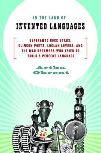
The idea is simple and quite beautiful: if we all shared a second, politically neutral language, people of all different nations and cultures could communicate freely and easily, and it would foster international understanding and peace. This is the idea behind the invention of Esperanto. It was a linguistic solution to what seemed like a linguistic problem. Esperanto may not have achieved the goal of ubiquity and international peace, but it has become the most widely spoken constructed language in the world. Much of its success has to do with its design as a language. The grammar is very regular and easy to learn, but it also has a flexible and poetic nature that facilitates wordplay and artistic expression.
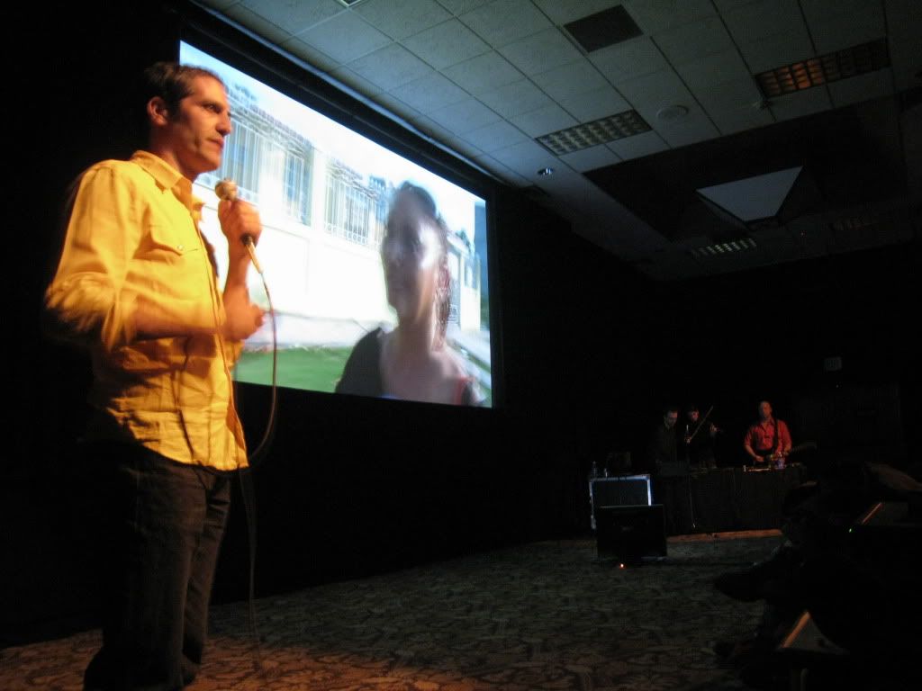
For this episode I talked with Sam Green, director of the live documentary Utopia in Four Movements. “What’s a live documentary?”, you ask. Good question. Quoth the website: “In this ‘live documentary,’ filmmaker Sam Green cues images and narrates in person while musician Dave Cerf performs the soundtrack.”
Above: Sam Green performing Utopia in Four Movements.
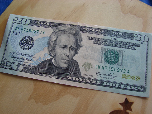
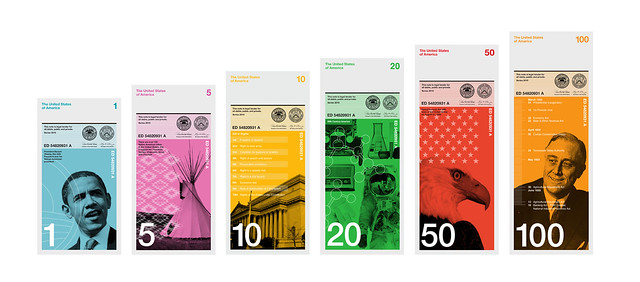
US paper currency is so ubiquitous that to really look at its graphic design with fresh eyes requires some deliberate and focused attention. So pull out a greenback from your wallet (or look at a picture online) and really take it in. All the fonts, the busy filigree, the micro patterns…it’s just dreadful.
Even though paper currency itself, just idea of money, is a massive, world changing technology, the look and feel of US paper money is very stagnant. Richard Smith is the founder of the Dollar ReDe$ign Project and in an article in the New York Times, he pointed out five major areas where the design of US currency could improve: color, size, functionality, composition, and symbolism.
The worst aspects of the design of the greenback are illustrated in this video by Blind Film Critic Tommy Edison.
It just so happens that Australian currency addresses each and every one of the points made by Richard Smith. Tristan Cooke and Tom Nelson of the blog Humans in Design are big fans of all the design innovations in Australian money. Aussie polymer notes are varied in color, get larger with each denomination, are more durable and are generally considered better and easier to use than US currency.
But there are some interesting reasons why the greenback is the way it is. David Wolman, author of The End of Money, explains that the legacy features that make US paper money look stale and anachronistic are meant to convey stability and timelessness. Since the US economy is so important in the world economy, why mess with it? Some fear that changing the design of the currency significantly (or eliminating the penny) could undermine the faith in the federal reserve note.
Even though Tristan and Tom are fans of the Australian polymer bills, they share Wolman’s view that the more interesting future innovations are not going to have anything to do with physical cash. Clever user interfaces that help us manage our money better, while providing even greater convenience, are getting more refined and accepted. So that ugly $20 in your wallet may never actually get prettier and more functional, it’ll just be gone.
Extra: Below is the 2010 winner of Richard Smith’s Dollar ReDe$ign Project, submitted by Dowling Duncan.
After we told him Tumblr’s data confirms he’s the longest-running everyday GIF artist, he said, “I have no idea how to word what I am feeling to be honest. I am really moved.
Awww. And as if his GIFs themselves weren’t inspiring enough…
His advice to artists on their own everyday creative journey is, "Don’t worry so much. So much greatness is ruined by anxiety. Some days will turn out like garbage, some days you will be magically inspired and you will make something you are extremely happy with. The great thing is that the days just keep coming.”
It’s been a beautiful four years, Tyler. Here’s to four more.
The idea of being fined for crossing the road at the wrong place can bemuse foreign visitors to the US, where the origins of so-called jaywalking lie in a propaganda campaign by the motor industry in the 1920s.
@kohlerco just gave @arcsine_oakland these chocolates that are colored like their various faucet finishes! This is not a paid product placement, I swear. Just a nifty idea. That we are currently snacking on.
The building ends up being so ambitious that it goes significantly over the budget. Attempting to rein in the budget (aka “value engineering”) leaves the project either stripped down or very late or both.
The idea of the concert hall becomes unpopular, and is protested by members of the public, who often foot the bill. The hall is constructed, and it is either beloved or rejected, though rarely is it an acoustical failure. Often if a new concert hall fails, it fails architecturally.