
Daily Design. Current Location.
Daily Design. Current Location.
See more posts like this on Tumblr
#pin #pinpoint #point #location #map #google #google maps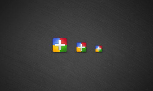
Daily Design. Google+ social icons. Download them if you want right here. http://www.anthonywartinger.com/extras/07.06.2011-GooglePlus.psd
Some real ballsy Google Android advertising. Beware the wrath of Apple.

Daily Design. Evolve, or dissolve.

Daily Design. Just incase you were wondering… I am here. Please don’t kill me.
I’m a sucker for a rainbow logo.
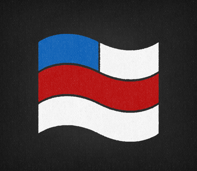
Daily Design. A little something for flag day, designed from the pin Stan wears on American Dad.
Hello folks. Time for the second installment of ⌘See, the feature in which I call point out and examine blatant rip offs in the world of design. This time we’re moving to he web and looking a what happens when a small company lacks creativity and produces a poor mans version of a good website.
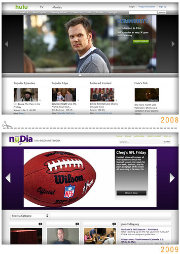
The top image is of hulu.com, a video website sponsored by television networks. Hulu provides television shows that have recently aired for free to anyone who wishes to view them. The lower image is a website called nuDia.tv, nuDia is a video website as well, focusing on original, and mostly sub par, programing. Now you can probably see the simularities by just looking at the sites but i’m gonna point out a few thing.
The entire layout of the site is stolen, a basic white header, a large banner featuring a gallery slide show and a four column grid for the body. The main offender is indeed the banner. It’s functionality is exactly the same, it uses white arrow buttons to change the images and a gray transparent overlay to give a quick description of the video. Now if this wasn’t bad enough nuDia’s logo also seems to have been ‘inspired’ by the hulu logo.
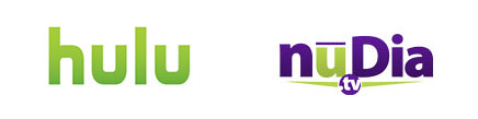
How are they going to take the only shared letter in the names and steel hulu’s lime green gradient. It’s kind of baffling how someone can lack this much of a creative soul. It’s actually funny how nuDia focuses on original programing but has absolutely no originality in its website and branding.

LOGO 03/30 - Fluttercuts
—
Introducing Fluttercuts, a fictional kid friendly salon for the whole family. While doodling I had the idea to combine a pair of scissors with a butterfly. It wasn’t quite working until I stumbled upon this funky font ‘Sutturah Fat’. I loved it’s playfulness and sharp inkwells and used them as inspiration for the logo details which helped bring all the elements together!

LOGO 02/30 - Spokes
—
Today I designed a logo for Spokes, a fictional cycling themed pizza joint that specializes in fast and delicious New York style pie. Whether you’re riding a fixie or still in training wheels it’s always a good time to give Spokes a spin!

LOGO 01/30 - Roman’s Candle Co.
—
Every day in April I’m going to be designing a logo for a fictional company, trying to stretch my legs and create some fun design work while I’m at it!
Today’s concept is a play off my middle name ‘Roman’ and the ‘Roman candles’ firecrackers to create a logo for a classy candle company. Rome wasn’t built in a day but this logo sure was!