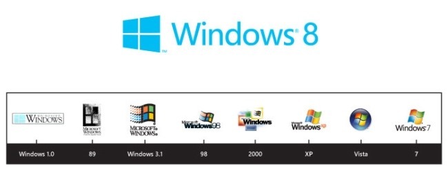
So I have some real mixed feelings about the new Windows 8 logo. I’m thrilled that the folks at Microsoft finally let go of all of the flag symbolism they had been hanging on to for years for no real reason.
I agree that the new logo speaks clearly to Windows new Metro UI, and it is the the realm of the Swiss International Style, but I think it kind of misses the mark. It checks all of the appropriate boxes, but just feels a little bit dead to me. It really does shine in motion, and I hope that Pentagram and Microsoft have some innovative applications of the logo in interface (?).


![input[type=“reset”]:disabled](https://64.media.tumblr.com/f78f02e95b5a22a0e9b402a721170b8d/tumblr_nozvs49KH91rqbl96o1_400.jpg)