Few would argue that there’s no benefit in increasing your verbal vocabulary. Having a larger set of words from which to choose not only allows you to articulate your thoughts more clearly to an audience, it presents a more sophisticated mental framework for the genesis of your own ideas. There’s a greater pool of resources at your disposal. Even if you don’t directly use all the words you’re able, having them there, capable of flowing naturally, multiplies your capacity for expression.
The same is true for drawing skills, especially when it comes to cartooning. As has been discussed before, the nature of the visual narrative is that a cartoonist is writing with images. The more well-rounded the skills of that artist, the more diverse and effective the visual narrative can become. Draftsmanship, in particular, can be defined as the capacity to effectively illustrate, regardless of context.
Clarity of Expression
This is the most obvious advantage. Being able to draw a variety of things well means the tools at your disposal are effective and diverse. For example, being able to draw figures is good, but being able to draw an infinite number of variations of that figure means you’re able to instinctively select the most appropriate pose/gesture/etc. for a scene.
Style is Grounded in Realism
While this is a fairly simple concept, you’d be surprised how often it’s overlooked. Most comics don’t benefit from extreme realism, but the ability to render things realistically strengthens and expands your capacity to stylize your art. If, for example, you’re poor at drawing hands, any attempt to stylize or minimalize the details in cartoon hands are going to be limited, in both style and expressiveness.
Learning to draw based exclusively on the drawings of others (like, say, manga) is going to severely limit your skills, because you’re not actually learning to draw the forms upon which the style is based. You have to know the rules before you can adequately break them.
Visual Flexibility = Mental Flexibility
In short, the more things you can draw intuitively, the more creative you can become. It’s true! When sketching or even doodling, our brains tend to default to shapes and forms we find easiest to draw; expanding our visual vocabulary expands the amount of default forms we can draw, and by extension, the diversity of concepts that can easily flow while brainstorming.
Often, being able to draw new things presents us with ideas we’d otherwise never consider. Also, simply being comfortable with drawing more things means you’re instinctively more likely to try new things. This applies to both visual design (coming up with new objects/locations) as well as raw ideas. You may not get an idea to write a scene/comic/joke about an Aztec flying machine unless you were comfortable drawing those basic forms. Likewise, without an artist having the prerequisite drawing experience, he or she may not get the idea to set a scene in a 17th century pirate cove rather than a college dorm room. It’s not so much that a less well-rounded artist couldn’t draw these things, it’s that he or she is less likely to even consider it, as it’s outside the comfort zone. It’s important to push our boundaries, but if we’re too uncomfortable with every visual element of a project, ideas aren’t going to flow naturally, and we’re actually incapable of challenging ourselves effectively.
If you look for it, you can tell when an artist is extremely skilled, regardless of how complex or simple their style may be. They challenge themselves, and their art and writing is dynamic:
A strong vocabulary means not just having tools at your disposal, but being comfortable using them. Even if you’re drawing something as simple as a stickman comic, having a foundation of strong draftsmanship expands your creative potential a hundredfold.
I mentioned before some of my favorite character designs in the world of comics and have been meaning to tackle this subject again. I came to realize, however, that “character design” is itself a fairly massive subject, and that it would be best to break the topic down into separate installments. Today, true believers, we’re going to talk about outfits and costumes, which are often a pivotal part of a character’s design.
3 Essential Questions
Clothing can convey quite a bit of conscious and unconscious information to the reader, but it should never be doing 100% of the legwork. Body language, shape and overall behavior all come into play when building a character, and the trick is to figure out what clothing can do that these other elements can’t. To get started, it’s important to ask some basic questions about your character before jumping into costume design.
1) Costume Hierarchy
How often does this character appear? Is it a main character or a side one? Primary characters have more complex needs than side characters, which is to say that the more information you have about your character, the more that can be conveyed in their appearance. Additionally, the more frequent the character appears, the more versatile the design needs to be.
2) Environmental Relationship
If it’s a side character that only ever appears in one setting, for example, you need only design the outfit to fit in that environment. If they are a main character, though, chances are you’ll need the outfit to mesh with more than one setting.
3) The Naked Test
Is your character recognizable without any clothes on? Body types, especially those of the main cast, should be distinctive even without the help of any outfits. The naked form is the foundation of all character design. Before you start dressing your body, make sure it’s a body worth dressing.
Once you’ve sufficiently answered these questions, it’s time to jump into the actual design phase!
Shape
Every character, no matter how complex, should be designed around an overal unique visual shape. This theme should not repeat in any other character. This shape should be readable enough that if you were to shrink all your characters into a super-simplified cartoony state, they should still be distinguishable. Character designs follow a hierarchy: you grab the reader’s attention with the most essential information and then invite them to investigate the details. If important elements of your design are only evident in the details, then it needs to be reworked. If your character is not completely distinguishable in silhouette, it needs to be reworked. Detail should always radiate from the core theme.
Kim and Vonnie stay distinct in a few ways.
The primary difference in shape between the above two characters is one of curves versus triangles. Vonnie is very angular, and her clothing’s angles mimic the scaffolding of an art deco building to emphasize her height and posture. Kim’s outfit makes her look shorter, but jaunty. There are a lot of soft curves going on there to make her seem younger and more innocent.
Action
What does your character do? In what way would their clothing reasonably convey how they spend their time? This is an easy question if it’s a uniformed occupation, but it certainly doesn’t stop there. A more bookish or socially inept character is often prone to mismatched clothing, while a person of a very high social status is often wearing clothing that is physically less practical than those of the working class.
How does your character move? What are their default postures and body language? A good outfit should accentuate the body movements that you deem most important. If a character stoops and hunches a lot, their clothes can augment that behavior. For example, Kim is frequently hunched over, so I tend to dress her with a hood that’s shaped to go with poor posture, as well as a repeating “arch” shape to suggest this basic form.
Communication
How much does the character wish to communicate with their clothing? Not everyone wears their personality on their sleeve, nor is everyone especially fashion-conscious. Nothing’s worse than having a cast where everyone is immaculately dressed and overdesigned. A more outgoing character might be more aware of their appearance, while a more introverted one may be less concerned. To add another layer, a character may dress a certain way to disguise something they don’t want to show to others, just as someone might act overconfidently to hide their insecurities. You can tell your audience a lot about your character through what that character chooses to display to others.
Repetition
Core shapes and patterns should repeat on the outfit. The entire design should exhibit some bilateral cohesion, which is to say if you were to cut the character in half horizontally or vertically, each part should look like it belongs to the other.
As mentioned, Kim has a lot of solid colors and arch shapes which are broken up by fabric and metal seams, with very few sharp edges.
Vonnie, on the other hand, is structured almost like a building, with vertical lines and triangles that take the shape of supporting beams on the surface of her outfit. Her triangles and broad horizontal planes repeat throughout her outfit, including her glasses.
This extends to multiple costumes worn by the same character. Even if a particular character changes clothes, the core shapes should still be evident. Scott Pilgrim is a good example of this. Most of the cast change clothes frequently, but in each scene it’s generally easy to recognize the characters by the “type” of clothing they choose. The details change, but the essential shapes do not.
Color and Contrast
Different colors can imply different moods. "Winter" colors like cooler blues and purples can suggest an introspective or reserved personality, while warmer colors like yellow or red can imply a more energetic attitude. If your character only ever interacts in one type of setting, you only have to worry about how those colors will fit in one environmental color palette. If, however, your character needs to mesh well with more than one environment (as is usually the case with protagonists), you have to make sure your character’s colors will fit with multiple settings.
Also, don’t be fooled by superhero comics: it’s generally bad form to have two dominant colors in a single costume. My personal rule of thumb is to have no more than one prime color in an outfit design, followed by a secondary and then supporting colors.
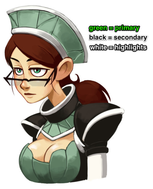
In the case of Kim’s outfit in Dark Science, the primary color is black, with the secondary being off-white. These are then supported by the muted blue and silver accents that appear in both her prosthetics and clothing. Color and value contrast is very important, especially for a main character, which is why Kim’s basic palette can be reduced to black and white without losing any essential information.
Vonnie’s outfit is more colorful, but less contrasted as a whole. Green dominates and is blocked in by a secondary, warmer black. Green is the complementary color of red, and so her clothes naturally bring attention to her hair and reddish skin tone, inherently highlighting more sexual elements than Kim (whose black outfit essentially matches her hair). White is also present, but it’s only a supporting color here.
Simplicity
Above all else, keep it simple. Comic characters are not pin-ups or other illustrations; you have to draw them over and over again, from various angles. If you pile on too much detail, you’ll wear yourself out slogging through all the bits every time you have to draw them.
If you follow all these rules, good costume design should create this basic pattern when presented to a reader:
Read: Silhouettes and essential shapes should be instantly recognizable
Inform: The costume should then tell the reader essential things about the character
Compel: The costume should then invite the reader to learn more about the character
Move: The costume should never impede the flow of action within the comic
If you stick to these basic guidelines, you’ll never fail. Next up on character design: bodies and faces!
So Cameron Stewart and Babs Tarr’s new Batgirl design was so great I just had to draw it. This is one of those redesigns that I hope sticks around, like Darwyn Cooke’s Catwoman.
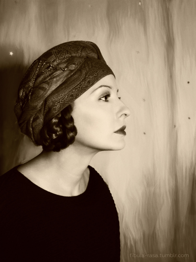
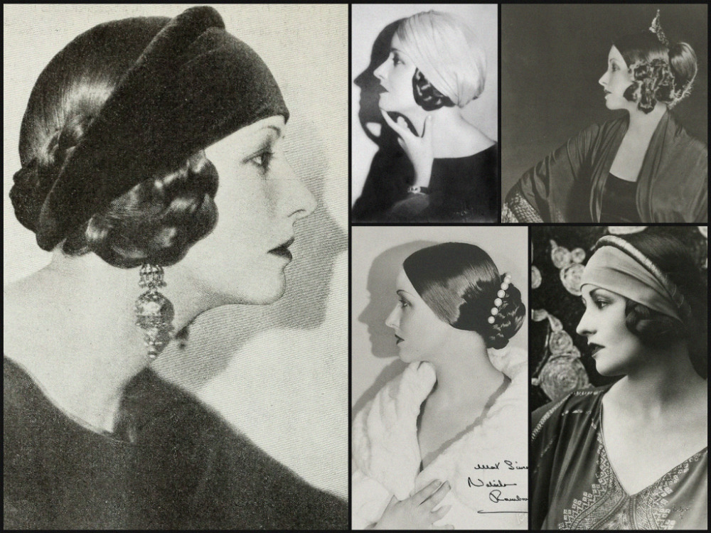
My closet cosplay of Natacha Rambova’s signature look from the 1920s
It’s unbearably common for people who have written about Natacha Rambova to emphasize that her “real” name was “Winifred Hudnut.” In reality, Rambova had about a half dozen names she went by (or could have gone by). Natacha Rambova was the name she took when she began her working life as a teenager with Theodore Kosloff’s ballet company—hence the Russophone name. And, as Rambova was a person who first and foremost lived to work, sticking with her professional name seems true to her character, Slav or not. You see, the primary reason Rambova was (and is) subjected to this passive-aggressiveness is part of a lingering effort to delegitimize her and her work. Sometimes that takes the form of calling her Winifred Hudnut and sometimes “Mrs. Valentino.” While there are valid reasons to criticize Rambova and her work, the aspersions typically lobbed at her fully miss their mark because they’re motivated by the desire to belittle a woman who knew the value of her work and her art and had the necessary privilege to fight for it.
"Natacha Rambova seems to belong most to me, the individual I think I am, but of course, I wasn’t born that way."
—“Wedded and Parted” by Ruth Waterbury, Photoplay, December 1922
Character design is paramount to pretty much any kind of comic. Most comics have things in them, and some of those things are characters, and those characters better be well-designed. Design allows the artist to communicate essential information to the reader about a character, and a good design allows for versatility independent of minor details. I’ll probably write a more specific post later about the mechanics of character design, but for now I’m just compiling a list of my personal favorite comic character designs. All of the one I list exhibit all of the key essential design elements:
Silhouette - the outer shape is clear and unique
Value - the lights and darks provide effective contrast
Color - meaningful and compelling color choices
Versatility - details of the design are flexible
Iconic - striking, memorable imagery
Here are my favorite designs from the world of comics:
#10 - Spider Jerusalem
The crotchety protagonist from Warren Ellis’ spectacular cyberpunk series Transmetropolitan was designed by Darick Robertson. It’s a masterful exercise in simplicity; Spider’s outfit is mostly black, bisected by a “band” of light tone created by his exposed torso. He’s a bit of a looming figure, but it’s broken up nicely by the odd glasses, which are really the most distinct element of the character. They’re not only instantly recognizable, but the unusual pairing of shapes suggests a facial expression (specifically the raising of an eyebrow). This is a great twist on the iconic nature of sunglasses, which are traditionally associated with the hiding of expression.
You can pretty much know it’s him from any angle, and even from silhouette, Robertson generally maintains the sunglasses as visible. Clarity of design and the striking shapes makes Spider Jerusalem a visually memorable character.
#9 - Thor
Designed by the king of superhero comics, Jack Kirby, Thor succeeds in suggesting historical and mythological elements without being bound to them stylistically. Aside from the hammer, there’s very little that’s literally Norse about the details of Thor’s outfit, but Kirby gets the point across effectively and stylishly. Wrapped boots, the suggested armor circles and the feathered helmet are there to add to the theme of a near-invincible god, rather than hit us over the head with the premise.
All the primary shapes and colors emphasize Thor’s power and build: his exposed arms and wrist bands emphasize his musculature, and the pointed shoulders and raised cape accentuate his already broad frame. Even the shape of the hair hugs the outline of the head to suggest both a powerful and royal feel.
#8 - Calvin & Hobbes
I’m counting these guys as one design, as one really doesn’t work without the other. The beauty of Calvin & Hobbes is that they contrast so well, and their design tell us not only about themselves but about each other. Calvin’s diminutive, his scruffed hair and dropped face suggests a child at odds with authority, but only through his own chaos and not through direct malevolence. Hobbes towers over Calvin, and often hunches a bit to see him, emphasizing that he is often humoring Calvin’s speeches. One thing I especially like about Hobbes is that although he’s very cartoony, he still moves and acts like a cat. His body coils and stretches, and his fur will often stand on end in appropriate fashion. It’s nice to see a character that isn’t just “generic talking animal #357.”
#7 - The One Electronic
You didn’t think I wouldn’t have a robot, did you? T.O.E., the mysterious sometimes-protagonist from Evan Dahm's Overside stories, is a good example of a character design that isn’t tied to a specific costume. There’s definitely a color theme and general silhouette requirements (purple and white are dominant, with either a cape, poncho or coat), but it’s T.O.E.’s distinctive head that gives him away. His face is a television screen that, in each panel, displays a different image from vintage film or television (despite existing in a completely different universe). It’s an unusual flourish that is never explained, which is all the better.
This character reeks mystery, and everything about the design emphasizes that: the head is a simple, recognizable shape, the colors are always subdued and T.O.E. can somehow eat and smoke a cigarette with only a glass screen. When we see T.O.E. we immediately want to know what he’s thinking. It’s a character that draws us into the mystery of Dahm’s stories.
#6 - The Elric Brothers
Edward and Alphonse Elric, the beleaguered protagonists from the manga Fullmetal Alchemist, are a wonderful exercise in shape and silhouette dynamics. Al, the giant suit of armor, plays against visual type and generally behaves very timidly, while Ed is the diminutive hothead. The designs are largely about shape contrasts; despite having some spikes and a mean looking head, Al’s body shape is bulbous, almost like a baby or toddler, hinting at his childlike nature. The shapes created by Ed’s red coat and unusual cutoff jacket make him look shorter than he is, and there are some subtle sharp edges created that suggest his prickly personality.
The designs also tell us about the history of the characters, specifically the premise of the show. Al actually has no body, his soul bound to this suit after their accident. Ed too has a prosthetic arm and leg, which are sometimes (but not always) hidden by his outfit. They’re tough kids with a rough history, and it comes through perfectly. Also I’d be lying if I said Edward’s prosthetics weren’t a partial inspiration for my own protagonist.
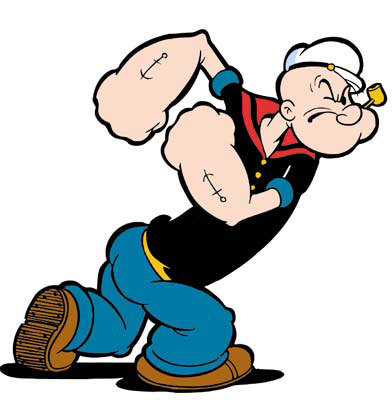
#5 - Popeye
Ugly as sin and built like a bag of hammers, Popeye’s visuals communicate so much about his character. His head looks like it was caved in, perpetually in a facial expression of mild annoyance. His limbs look as if they were squashed, emphasizing a scrappy, combative personality, and the second highest contrast area directs us to his bulbous arms, clearly indicating this is a character who does most of his thinking with his fists. Popeye is one of the best examples of design going beyond just what the characters are wearing and into how the characters are physically built.
#4 - Hellboy
Mike Mignola is one of my favorite comic artists in general, and nowhere is his solid art sense more evident than in the design of Hellboy. There are some strong, simple shapes going on here, both in the massive stone right hand and in the two “circles” on his head (which are actually shaved down horns). The big, clear shapes make it possible for the little shapes (like the details of the belt and coat) to be very flexible, meaning Hellboy doesn’t really need a set “costume” for us to know it’s Hellboy.
Mignola avoids the traditional “heroic broad shoulders” design elements for Hellboy, instead pushing the posture and build of a working class man. Fighting monsters is just his job, and there’s a tired look in his expression and in the downward sloping shapes created by his coat and body. He’s a tough, stoic character, and everything about the design conveys this. If you didn’t know any better, you’d think the guy was carved out of rock.
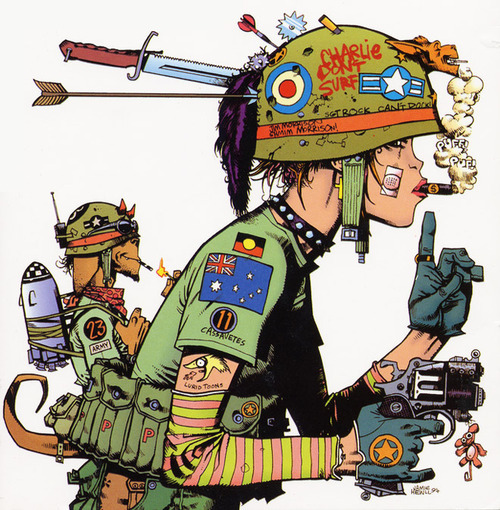
#3 - Tank Girl
Tank Girl, brainchild of Gorillaz co-creator Jamie Hewlett, is a special case in a couple ways. For starters, she’s sadly one of the only dynamically designed female characters in mainstream comics, but also she seemingly breaks some of the rules I put forth at the beginning. Where are the clear shapes, colors and lines? They’re actually there, but they’re produced by the chaos of the details. I mentioned earlier that we don’t really need to know the details of what’s on Hellboy’s belt, just so long as it’s there and there’s stuff on it. This concept is taken to its extreme with Tank Girl, who is generally decked out in all sorts of military and punk-themed paraphernalia. The designs are anything but generic, and despite what should be clutter in the hands of any other creator, it holds together. Why?
There’s a method to the madness. There are repeating elements like the helment, her hairstyle (within a range), the types of shapes created by the gear and clothing. Similar to T.O.E. earlier, certain types of clothing “fit” the design, while others don’t. It also helps that outside of the clothing, Hewlett designed Tank Girl’s body and face to resemble a real specific person and not “generic comic book lady.” If you’ve seen his work on Gorillaz you’ll know that he does a good job of swapping out costumes on characters without ever losing the iconic “feel” of those characters. You can always tell it’s Tank Girl.
It’s also not just style for its own sake. Tank Girl’s appearance tells us a lot about the character: crude, chaotic, but pragmatic in her own right. This also sets the theme very well for the tone of the comic itself. An absolutely ingenious design that would be a mess in the hands of a lesser artist.
#2 - Arzach
French comic legend Mobeius’ comic Arzach has always been near and dear to my heart. Although many in the US may not know it directly, we’ve seen its legacy, being the partial inspiration for such great works as Nausicaa and Panzer Dragoon. Arzach, like Tank Girl, isn’t tied to a specific outfit but rather a style of outfit, the most iconic two elements being his unusually pointy hat and his “stone pterodactyl” steed. However, unlike the intentional chaos of Hewlett’s design, every element of Arzach’s outfit is carefully chosen: he is a warrior and traveler, and carries with him only items of absolute necessity (aside from the ceremonial trinkets).
Arzach never speaks a word in the series (in fact, it’s virtually wordless), flying across a dreamlike landscape in his surreal, partially symbolic adventures. Not only does everything about the design convey “weary traveler,” but it also hints at a culture and world we’ll never fully know. His tunics are always wide, emphasizing his broad shoulders, and he is covered from head to toe in hand-stitched garb and gear, reminiscent of both Mesoamerican fashion and Natives of the American West. With his pterodactyl, he symbolizes a striking, dreamlike freedom that we want to follow, but the weapons on his person also suggest a warlike past. He is the Odysseus archetype, forever wandering, but also conquering his foes through wits. Arzach is the ultimate visual oneironaut.
There’s a wide variety of approaches when it comes to environment designs in the comic medium, and although there are certain key elements that divide comics from motion media, it’s somewhat useful (in the case of environments) to place comics in two basic camps: film vs. sitcom.
Modern newspaper strips, especially the gag-driven variety, employ environment conventions similar to that of sitcoms. Sitcoms trace their origins to stage and radio performances, where the focus is very much dialogue driven. Most of the physical action is exclusively between the characters, and it’s very rare for the actors to turn their back to the audience (partially because their voices need to project in the direction of the viewer). As such, the “sitcom” variety of comic strip often employs minimal visuals when it comes to environment, as the primary goal is to deliver a verbal punchline. There are some excellent examples of this style of comic strip, though I personally feel this approach is overrepresented in American comics, especially the web variety, and it’s often employed for comic styles that don’t benefit from this minimalism.
There’s another breed of comic, however, that parallels more closely with film. Because of the nature of the medium, film is inherently (though not exclusively) more location-driven than the stage, and comics of this style in turn rely on a stronger connection between the characters and their environment. Comics are about efficiently conveying concepts and moods, and this style demands an intimate connection between reader and the world being presented by the cartoonist.
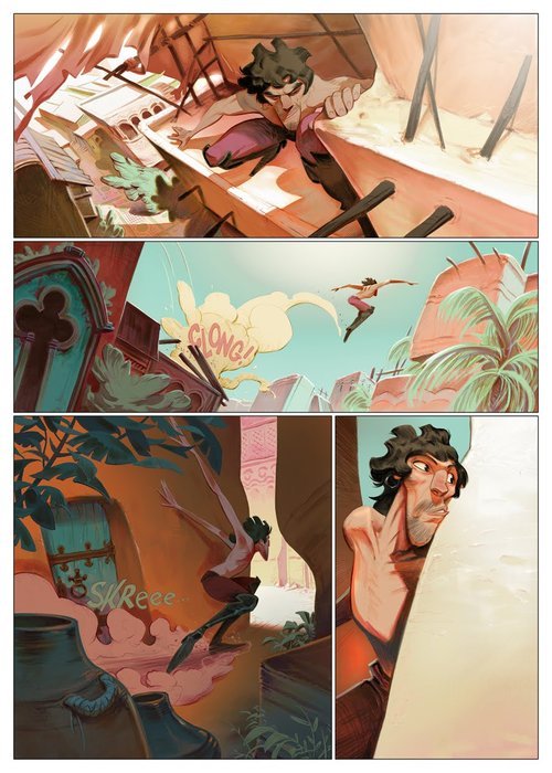
In the above page by Enrique Fernández, a significant amount of information about both the character and his environment is being conveyed. Aside from the more obvious elements like the character’s personality being conveyed through body language, there’s a lot the environment is implying. The top panel introduces a distant vanishing point behind the man, giving the impression that he’s traveled far to reach this point. The low angle of panel #2 emphasizes the height of the action as well as the potential distance (and danger) of the fall. The dark shadows and narrow spaces of panel #3 indicate a change of mood from freedom to impending danger/detection (the narrow band of “light” space cutting through the panel and the character’s silhouette is especially powerful). The final panel emphasizes that the man does not want to be seen; the wall seems to be pushing back against him, trying to shove him out of frame. We want to know what he’s looking at; we were set up with the previous panels with a sense of motion, and now though he seems to be frozen, the environment now has become the primary actor. We’re drawn in without a word of dialogue.
Fernández is also good at establishing an environment as a character unto itself.
As is the case with the above page, oftentimes a story requires that the setting be much more than a place upon which the plot unfolds, but an active participant in the antagonism or encouragement of the characters. In the end, regardless of the specific purpose, it should always be about engaging the reader, inviting them into the world you built and keeping them interested in the unraveling of the narrative.
Superhero comics, oddly enough, should benefit from this greatly but it’s rare to see it effectively employed. There tends to be an immense focus on the design and posing of the characters with very little attention paid to how those characters are interacting with the environment. Ironically, western superhero books seem to take their cues from the sitcom school, where more often than not the characters seem to be posing for a photograph that no one’s taking.
Obviously I’m not dismissing all superhero comics, but it is a dominating trend in the most popular styles. There are, however, some powerful exceptions, like the masterful Frank Quitely:
The important point here is that it’s essential to decide what tools work best for the comic at hand. Mismatching approaches is an easy mistake to make, but it can carry extensive consequences.
Do you ever read a comic/watched a show with certain "design flaws" purely for the writing, or would things like same-face-syndrome and simplistic design/animation bother you too much?
Not so much, because if there are visual elements that aren’t working then that means the story isn’t being told well. A comic with a bad visual language is akin to a novel with terrible prose. Sure, you can overlook it a little bit if you’re interested in the core concept, but there’s a threshold. If there’s something that interesting in the plot, I’ll just go read a synopsis and not waste my energy.
An addendum to the Figure Design post: it’s a good rule of thumb to design characters and costumes from multiple angles and poses.
The anti-car culture on this website is so fucking annoying. Like, sorry I want to be able to get around without having to spend two hours taking three buses. Sorry I want to be able to go grocery shopping in the winter without having to lug heavy bags home through the snow on a fucking bike
so you agree that getting around most american cities in a convenient and timely fashion is impossible without a car? that public transit is largely non-functional to the point that people are forced to decide whether to sacrifice significant chunks of time, energy, or straight up cash?
you agree that most american cities have been constructed in such a way that demands using a car? that those cities are incredibly hostile to people who don’t have a car?
it’s not “anti-car” culture, it’s anti “car-culture,” and it sounds like you think it fucking sucks, too.
(why did you spend actual, real life money on this?)


