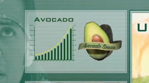
I rarely laugh about charts, but this Gawker analysis (and Subway’s “official” explanation) of the graph in their Advertisement made me LOL.
via ilovecharts:
162 notes
popsixsquishcicerolipschitz liked this
lechatelier reblogged this from ilovecharts
ollipopz liked this
greenvolcano reblogged this from ilovecharts
 rousse reblogged this from ilovecharts and added:
 They have NON-CARCINOGENIC AVOCADOS.
rmpark-blog-blog reblogged this from ilovecharts
matthurst reblogged this from ilovecharts and added:
I rarely laugh about charts, but this Gawker analysis (and Subway’s “official” explanation) of the graph in their...
ehalcyon liked this
weirderandwackier reblogged this from ilovecharts
 redeyedmice liked this
 - en-their-medh-riki-fara liked this
ihavenocoolname reblogged this from ilovecharts
obligateaerobe-blog reblogged this from ilovecharts
groovedude reblogged this from ilovecharts
goddesshecatea liked this
thebrightshapes reblogged this from shamelesshipsterscum
thekeylime-blog reblogged this from ilovecharts
 incorrectapus reblogged this from teslagoeszap-blog
 weens-world reblogged this from ilovecharts and added:
“Subway provided no peer-reviewed studies or sources for the data.” Love it.
thiscatiswithoutahat-blog liked this
orgulloyprepucio liked this
 libblee liked this
 mjsudhxgv liked this
 topolojack reblogged this from ilovecharts
 mattmansideas reblogged this from ilovecharts
heatherlockemadeit reblogged this from andreamcampos
primuscapio liked this
 b-vo liked this
 - readinglist32 liked this
enhalotricks reblogged this from ilovecharts
- slickmahoney reblogged this from ilovecharts
shpadoinkle12-blog reblogged this from theatlantic
ilovecharts posted this
- Show more notes