Aug
Picking a necktie, part 1: Color
Note: This is the first part in a series to help you with picking a necktie. Be sure to read the other parts if you have the time or curiosity.
Arguably a fundamental piece of knowledge when it comes to choosing a necktie, the color (or colors) you choose to put around your neck can serve various purposes.
I’m going to go through a few permutations here:
- Monochrome color matching your tie to your shirt and jacket:
- Contrasting the your tie to your jacket and shirt:
- Matching your tie to your shirt:
- Contrasting your tie to your shirt:
- Matching your tie to your jacket:
I think color is a good first topic when it comes to picking a necktie. Before you get into buying patterned or seasonal ties, you’re probably going to want to get a few solid-colored pieces of neckwear that will be more versatile as your wardrobe is still in the incubation stages. While this first part doesn’t necessarily deal exclusively with solid ties, many of the fundamentals can be easily grasped by focusing on color rather than pattern or seasonal texture – both of which topics I’ll cover in the upcoming days.
I think color is the toughest thing to master for a lot of people, mainly because there are a lot of possibilities about what could work. But once you understand a few guiding principles, it should become easier – and probably easier than pattern and texture.
Monochrome color matching your tie to your shirt and jacket:
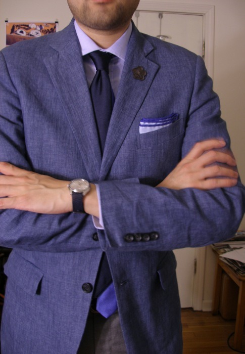
Choosing a monochromatic color scheme, where all the colors you’re wearing are various shades and hues of the same color, is probably one of the simplest ways to pick an appropriate necktie. It’s also one of the easiest ways to dress yourself. Pick a color, get a jacket/suit, shirt, tie and square that all fits in that color.
That’s what I’m doing today: using the color blue as a common theme for all the elements to follow. The jacket is a mid-range blue, the shirt goes a bit lighter. The tie darker than both. The pocket square echoes the shirt’s shade and its border mirrors the contrasting blade of the tie.
While this is relatively simple to illustrate with solids, it’s worth looking at a monochromatic scheme with patterns as well.
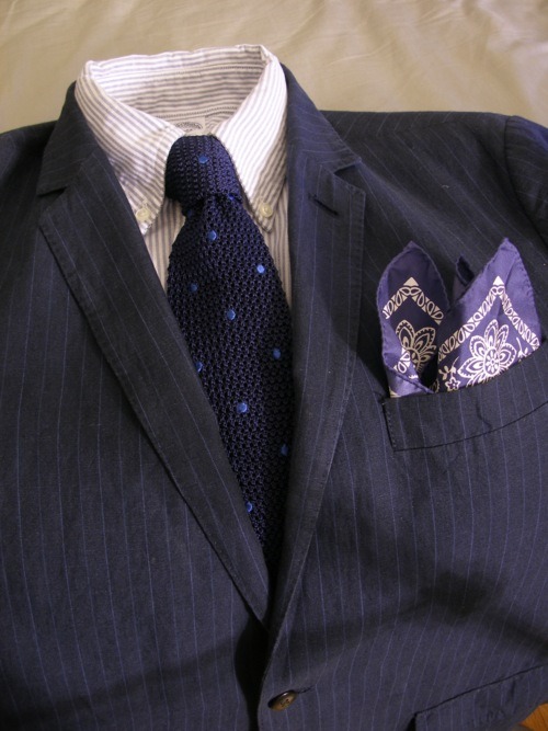
Using a monochrome approach with patterns means finding the dominant color in each element. Again, I’ve picked the color blue. Notice that it doesn’t mean all elements must be void of all other colors. Neutrals – grey, black, white – can be introduced and not upset the balance. Patterns can also be used, but keeping with letting one color remain dominant throughout.
If you decide to take the monochrome route, just keep in mind that you want to create a high amount of contrast between each element. Maybe keep your shirt on the light side, your tie on the dark side (with perhaps a lighter element) and your jacket somewhere in between. You don’t want to wear a hues too close together, making it impossible for each element to be distinguished. If you’re wondering if you’re doing it right, imagine your photograph was taken in black and white: would you be easily able to see your tie, shirt and jacket’s outlines? Or would they blend together?
Contrasting the your tie to your jacket and shirt:
This is also fairly easy to do. Keep most of your outfit simple, perhaps based around a neutral or monochromatic palette. Then use your tie (and perhaps pocket square) as a way to create a high contrast. Just note that if you do this, then your tie will be distracting away from the rest of what you wear. In some cases, I think this looks great. The example above is a play on the typical “navy blazer, white shirt, red tie”, which always looks good. You could swap that red tie out with almost any other primary or secondary color that’s not blue and have it look fine. Keep the tie simple, with only one other color – perhaps incorporating a color from the shirt or jacket – and it’ll probably work.
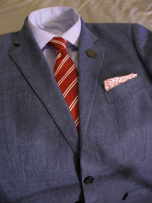
Matching your tie to your shirt:

This is probably the first thing many guys think about doing once they get a new shirt with way too many colors and find themselves looking for a tie that “matches” their shirt. Matching is obviously fine – it’s the basis of the monochromatic look, after all – but the problem often comes in when a shirt has a base color (white or blue) with several other colors in its pattern (imagine 1-3 different colored stripes or checks in the pattern). Remember: the more colors in your shirt, the harder it gets to match a tie to it. It’s for this reason I recommend solid-colored shirts or shirts with only two colors – a base color and one accent color.
In the example above, moving away from red, white and blue scheme would be possible, but it’s much easier to use the existing colors in the shirt. Looking at the shirt, the red definitely overpowers the white and blue, so it makes the most sense to downplay the red in the tie (or perhaps exclude it) and promote the white and blue. It’s a bit of team effort here in the part of the square and the tie. The tie’s navy color helps bring out the blue in the shirt, but doesn’t contrast the jacket. The tie’s red stripe hints at the shirt’s main color and also plays to the square’s secondary color. The white stripe acknowledges the shirt and also enables the pocket square to reference it, too.
You can see how this gets really complicated and limiting the more colors you involve in a scenario like this. Can it be pulled off? Sure, but buying shirts with lots of colors right away when you’re building a wardrobe probably isn’t ideal – because you’ll need ties to match it, which may not go well with other parts of your wardrobe. Something to keep in mind.
Contrasting your tie to your shirt:
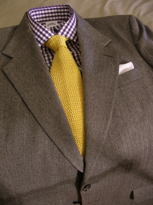
The last example could have gone a simpler and even more colorful route: ignoring matching and going for contrast. And it’s the same thing I’ve done here with this purple shirt: high contrast.
Contrasting is relatively simple in the case of this purple gingham shirt: look at a colorwheel and pick the colors directly across from each other. In this case, the opposite-facing color is yellow. And this same yellow tie would’ve worked, too, with the red-white-blue shirt in the previous section.
This works best when your jacket is on a neutral tone – or close to it, like a navy suit. Takes a bit of thinking early in the morning, but the results are colorful and yet still pleasing.
Matching your tie to your jacket:
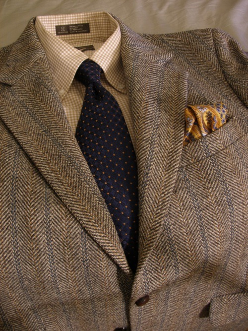
This is a neat trick to remember when you have an odd jacket, such as this Harris Tweed blazer, which has quite a few other colors in it beyond its brown base. The jacket has gold and blue fibers woven into its herringbone pattern, so it makes sense to use the necktie to bring out those elements a bit more.
Additionally, the tie in this case contrasts the shirt fabric, while the pocket square also picks up the colors in the jacket, yet compliments the pocket square by highlighting the gold as its base and blues as its secondary color.
In summary:
Learn to identify dominant and base colors. Then look at secondary colors in each element. Think of how you can play them off of each other, match them to each other, or compliment elements. It’ll take some practice, but it’ll help you decide on your next shirt or tie purchase if something fits into your wardrobe or if it’ll mean having to buy other additional elements to work with it. It’s worth keeping a colorwheel in mind and when you see someone wearing a great combination of colors, make a note of it mentally and try to think about why it works together.
Tomorrow: patterns.
178 Notes
datmenswear reblogged this from thesilentist
riyablack liked this
 mauro8980 liked this
 keykingronnied liked this
 jpv703 liked this
 thesepostsofmine-blog liked this
 blurrylight liked this
 facciolaccentosvedese liked this
belovedking87 liked this
beautiful-liberal-king reblogged this from thesilentist
more-than-a-teaboy liked this
satorialconnoisseur reblogged this from thesilentist
maharl-san-blog-blog reblogged this from thesilentist
ingmiguel reblogged this from thesilentist
- basilsco liked this
grooveatdrive liked this
pyrofection reblogged this from thesilentist
bburns25 liked this
loverofstories liked this
- gurasempha-blog reblogged this from thesilentist
deniseas4445-blog liked this
diana2345d-blog liked this
thesilentist posted this
- Show more notes