Aug
Picking a necktie, part 2: Pattern
Note: This is the second part in a series to help you with picking a necktie. Be sure to read the other parts if you have the time or curiosity.
After you’ve wrapped your head around picking a necktie based on color, then it’s a good time to talk the other obvious thing most people see when glancing at your neckwear: the pattern.
I’m not going to discuss the use of solids here. It’s fairly obvious: you can put a solid necktie with anything, whether the shirt and jacket are variations of solids or patterns. Likewise, if you’re wearing just solids, then picking a patterned necktie to go with your outfit is perfectly fine.
What’s worth discussing is the mixing of patterns in the various parts of your outfit. Notice: the focus here isn’t just on the necktie, but rather the outfit as a whole. You should keep in mind the patterns of each element: shirt, tie, square, jacket.
Because of my limited shirt and tie selection, there’s no way I could go over every single possibility you might encounter, but hopefully by discussing each of these looks you’ll get a better idea of the weird mental calculations to make when mixing patterns together.
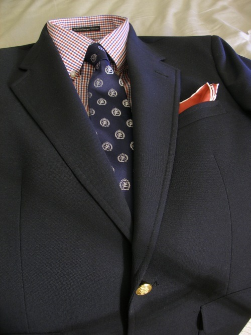
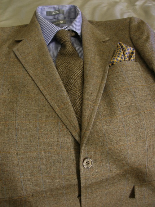
Stripes & crests vs. checks:

We might as well start with what I wore. While I won’t get too much into color again, it’s worth noting that I chose to color match the tie and shirt here, but kept the shades different. In regards to mixing patterns, this actually blends three patterns together: crests (or what you could call a repeating “dot” or “geometric” pattern if a different symbol were to be used), stripes and checks.
When you have a check pattern, I feel it’s good to go with one of two routes: a tie whose primary color is different from the dominant color of the check and features a stripe that references the color of the check – hopefully with the stripe being significantly smaller in size than the “stripe” of the primary color.
The other route I like to take with check patterns, especially gingham, is to have a tie that has a repeating “dot” pattern on a grid. I feel this brings a high contrast. This tie arranges crests in place of dots along a diagonal, which works nicely. Despite keeping the tie in the same color as the shirt, you get some distinct visual separation from the tie and shirt.
Dots vs. checks:
This is another (perhaps clearer) example of using a “dots” arrangement on a tie to pattern mix against checks. The repetition of the dots mimics the repetition of the check pattern, however, it contrasts not just in terms of shape, but of alignment. Notice how the dots are arranged on a grid pattern that’s been rotated on a 45-degree angle to the axis. You have two otherwise orderly patterned elements now at direct conflict with each other visually. This helps distinguish the two elements to the eye and yet manages to balance the look.
Paisley vs. checks:
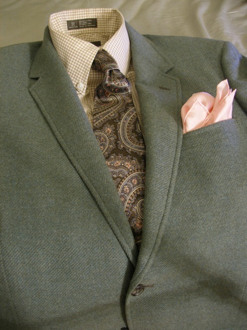
Another option to pair with a checked shirt (or a bengal striped shirt) is a paisley tie. Again, notice I’m staying with the same color, but varying the shades of the tie and shirt. The paisley has a huge pattern contrast with the grid-like gingham. Why do I think this works? Let’s take a look at a similar example below.
Floral vs. checks:
This outfit actually manages to mix three patterns: gingham checks, floral and dots (on the square). When you have a chaotic pattern, I often find it’s good to bring some order to your outfit by introducing strong patterns that are uniform in nature. Checks, grids, evenly-spaced stripes and dots all help contrast the randomness with some visual normality. The point is to bring some balance.
It’s for this reason that I think it’s dangerous to wear a chaotic necktie in paisley (or worse: a Jerry Garcia design) on a solid suit with a solid shirt and a no square (or a solid one). You have nothing to counterbalance that out-of-control element and frame it. The print just gets the run of the solid-palette yard and takes over. Visually, it’s distressing to witness and often I think it’s a sign of an unsophisticated dresser who says, “Oh, I’m totally going to wear this wacky, crazy, cool tie!” and seeks to make that something that will get him noticed. You’ll often find these people wearing novelty, cartoon or “holiday print” ties. Or worse, ones designed by Ed Hardy.
Stripes vs. stripes:
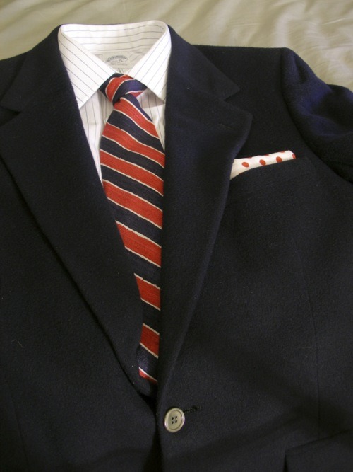
Beginner advice often says to avoid “stripes on stripes”, but don’t pay that much attention. You can have stripes on stripes – but you want to avoid having stripes of the same width on both your shirt and tie. Basically, if you have a pinstriped shirt, then avoid wearing a tie that also has pinstripes. Got a bengal striped shirt? Then don’t wear a tie with equally wide stripes as the shirt. My advice is to just know what kind of striped shirts you have and then buy striped ties that have a much more varied pattern.
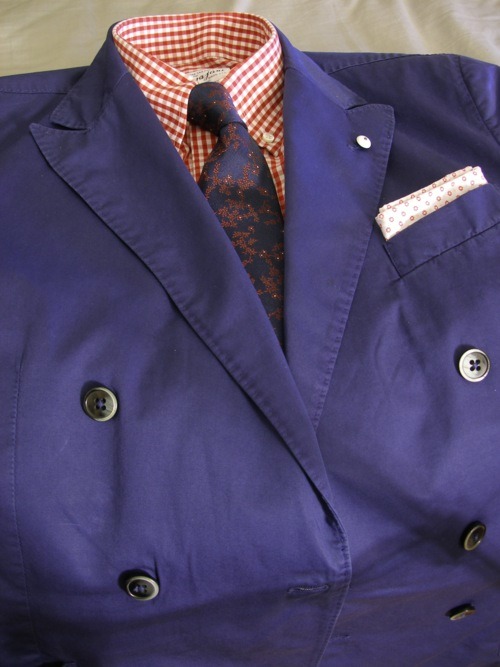
Stripes vs. checks:

The rules here are somewhat similar to the stripes-on-stripes rules: try to vary the proportion of your stripes and your checks in each element. The checks on the tie are larger than the stripe width on the shirt. You want visual disparity in terms of proportion when playing with these patterns which are composed of linear elements. The eye shouldn’t have a hard time telling them apart.
Checks vs. checks:
Oh sh*t! It’s just checks on checks on checks! A houndstooth check shirt with a Prince of Wales check tie with a windowpane check jacket. Again, the way to make this work is to not only vary the proportion of the different check patterns, but to also vary the types of checks being used.
Super-mixing patterns:
One of the hardest things to do is manage to bring together four unique patterns together in an outfit. Like what’s going on above. It’s easier to do if you stick to a monochrome theme, but it looks even dandier if you go for several colors at once. Definitely not for beginners, but it’s worth giving it a shot to teach yourself about pattern and color mixing/matching. It’s not something I do often – frankly, my mind isn’t that alert in the morning.
In summary:
You can either mix or match patterns, but you should try to vary the proportionality and size when matching (or even mixing, but it’s not as necessary when mixing). Keep in mind color rules while thinking about patterns. Tame chaotic patterns with orderly elements. Try to achieve visual balance.
If you want to really learn a lot more about pattern mixing (and about just every single topic in menswear), I suggest picking up Alan Flusser’s “Dressing the Man”, which goes over this topic quite nicely.
Tomorrow: textures.
Previously: colors.
149 Notes
bingbangs liked this
justpope liked this
vsop1989 reblogged this from thesilentist
estilosemfrufru-blog liked this
bertrandcosmo liked this
aestheticizer liked this
jjsalcedo10 reblogged this from thesilentist
ozryelv liked this
ialexdiamond liked this
 ixxvixcvi liked this
 cross-the-bridge-entertainment reblogged this from thesilentist
fourthxjuly reblogged this from thesilentist
wholecr3w liked this
thesupersunday reblogged this from thesilentist
theinfamousz-blog liked this
thesunsword reblogged this from thesilentist
cake9 liked this
deniseas4445-blog liked this
diana2345d-blog liked this
thesilentist posted this
- Show more notes