
A Charts of Charts, 2012

2105. The number of charts that one of Meetup’s two data analysts generated during the course of 2012.
Of course, volume isn’t everything. Sometimes it takes over a week of work to gather the data for a single chart, and a single chart can change the direction of a company. But it does show the sheer number of questions the Strategy Team gets asked during the day-to-day as we work to understand how people are using Meetup so that we can design and make Meetup better.
The Strategy Team here at Meetup is responsible for providing research and insight about Meetup as a whole to the entire company. From the community team to the dev team, finance/accounting to the board of directors, the small team of 4 strives to provide the information necessary to make smart decisions. When our two user experience (UX) researchers tallied up their work in 2012, they found out they ran hundreds of usability sessions, and a bunch of surveys. (But that’s a blog post for another day.)
For the two data analysts at Meetup, communicating insights is often easier visually, so a huge number of charts are created as insights both large and small are shared. Seeing what the UX team put together, one Meetup analyst decided to count how many charts he created in 2012.
What sort of charts and insights got shared in 2012? Stuff like this:
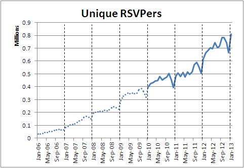
Monthly status updates, analytical models, board meetings, etc. Making the bulk of the volume, these are semi-automated with little hand-formatting details, and happen regularly - causing the regular jumps in the chart of charts. Here’s the monthly number of Unique RSVPers that go to Meetups every month since 2006.. Dotted lines are backfilled data, which are estimates.
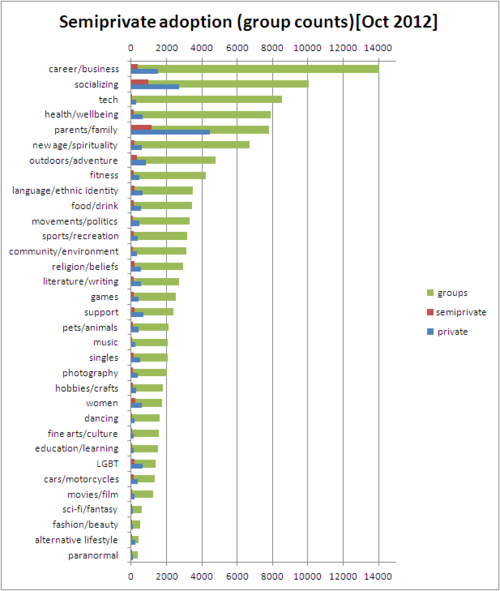
Ad-hoc stuff, for the random questions that come up every day. 497 of these were created in 2012. Here we had recently launched the ability for private groups to display some of their Meetup information, hopefully so that they can get more members to join. We were checking the various adoption levels by group category:
99% of this particular analyst’s charts were finalized in Excel so a script was quickly hacked together in Python to crawl his hard drive, find files that were dated in 2012, open each one in and count the # of chart objects inside. Sadly, sequentially opening ~1.8GB of excel files is a bit slow.
Code
For the curious, the actual python code used to do the chart counting is here.
Posted by randyau-blog 11 years ago
- 5
- Permalink
5 Notes/ Hide
cnhqhotel liked this
 tyushokigyotushin liked this
  fridleyfarmer liked this
 mlcastle liked this
makingmeetup posted this