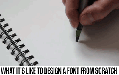
Steve Matteson has designed some of the most ubiquitous typefaces in the world, and engineered versions of Times New Roman, Arial, and Courier for Microsoft. Here, he reveals why every letter you see looks the way it does.
(via fastcompany)
 coconut-oil-hoe reblogged this from fastcompany
  strangehunger liked this
 itasai-lover liked this
nikl3 liked this
tienandsheins liked this
technicolorhousecat liked this
 nahdogyouarenthavingit liked this
 tana-the-dreamchaser liked this
poorlytunedpianoplayer-blog liked this
2173598-blog liked this
ridiculouslynonsense reblogged this from fastcompany
sheepishshark liked this
just-another-busy-fangirl reblogged this from fastcompany
the-confidant liked this
 odinoddly liked this
  sarcastic-sinnamon-roll liked this
 ktravel22 liked this
 ks-useful reblogged this from fastcompany
 dailydoseofwhy-blog liked this
jujubeas liked this
possummush liked this
pasta-nipples liked this
dsgfdsfd liked this
sunsetstylinson liked this
snowy-ravine liked this
mugglemax liked this
bint--jbeil reblogged this from fastcompany
nrcdrmi liked this
imperfectprep liked this
wistfullymusing reblogged this from steppingawayfromreality-blog
steppingawayfromreality-blog reblogged this from bookoisseur
kimochaa liked this
agirlincognito reblogged this from fastcompany
fastcompany posted this
- Show more notes