One of our most recognizable Olympics graphics is probably “One Race, every Medalist Ever,” a 3D rendering and video that imagines what a race of every athlete ever to medal in the men’s 100-meter sprint might look like.
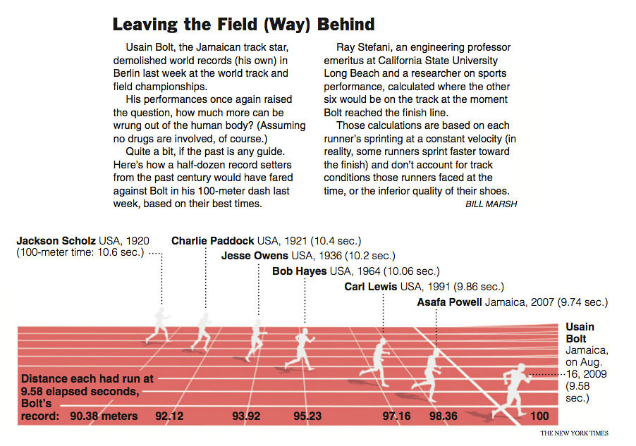
I’d love to take credit for the idea, but it’s not new. The first time I ever saw the idea was in 2009, when my colleague Bill Marsh had a small piece in the Week in Review after Usain Bolt got a 9.58 in Berlin, setting the world record that still stands.
Even this year, other news organizations did a similar approach. The Guardian made one in a retro homage to old video games and Slate had a piece based on the same concept. But one reason I think ours was so successful is that is put the race on a human scale – seeing all those athletes on an actual track is much more accessible than seeing a scatterplot. (Not that I didn’t make tons of scatterplots since they don’t really let me near the 3D software.)
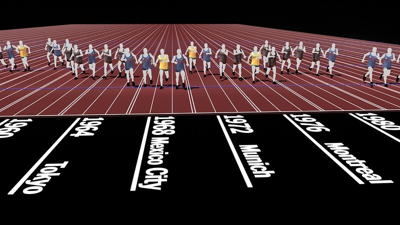
So Graham Roberts started rendering some people on a track based on some initial calculations. Even his first renderings looked pretty cool:

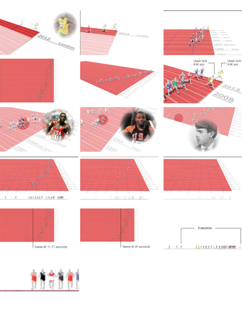
After that, it was just a (very slow) process of storyboarding the video. It’s surprising, to me, anyway, how much the final movie tracked our original storyboard:
Then it was just a matter of rendering all the frames, recording and syncing the audio, and thinking about how to turn it around as soon as possible after the result. If you look closely, you can see that the 2012 results are out of frame for most of the movie – it was mostly pre-rendered. (We also recorded slightly different scripts depending on who won. I didn’t really care who won, but I was sort of rooting against Churandy Martina of the Netherlands because I couldn’t pronounce his name right. Luckily for me, he got sixth.)
We didn’t end up turning it around as fast as we wanted to, but about 8 hours after Bolt had won the 100-meter final, the piece was up, and only a day or two later Graham and I had achieved a life goal of having Ashton Kutcher tweet our work.
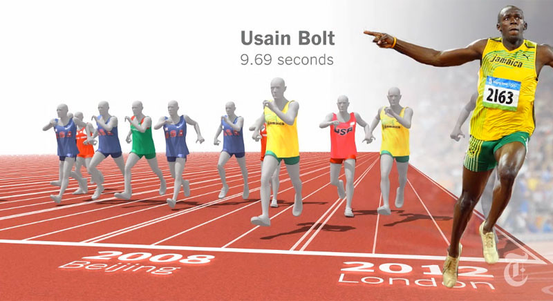
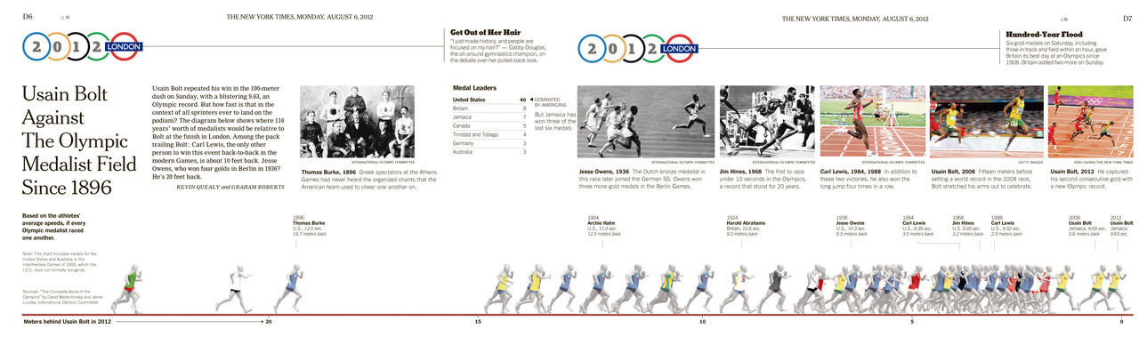
We also did a chart for print, which went across two pages. Although we had done the chart in perspective for swimming (I’ll get to that another time), the side view of these guys looked really cool, with Usain Bolt leading and everyone in history trailing behind. It was even cooler in the 2008 view, actually:

And in print on Monday, Aug. 6:
I have a couple other fun things from this piece, but I’ll save those for another day. (Like maybe tomorrow.)
vevetrois reblogged this from chartsnthings-blog
mrunderscore reblogged this from chartsnthings-blog and added:
Nice, “How we did it” on one of the most talked about olympic interactives this year. Well worth the read.
thoughtlogbook liked this
zonovo liked this
ellenalexia liked this
charmanderinchief-blog reblogged this from journo-geekery and added:
BEST
 contextual-awareness liked this
 journo-geekery reblogged this from chartsnthings-blog and added:
Always amazing. I kinda wish our desks were bunked so I was even closer to the thinking behind these great explainers....
drewvigal liked this
brainfoods-blog liked this
 yoshang liked this
 chartsnthings-blog posted this