Label Positions Revisited
In the previous post, I let my dislike for labels on the left be known.
One common rationale for using left labels has to do with saving vertical space. Another method I often see is using placeholders/watermarks as labels. This can make for clean looking forms, but if not done properly can lead to both accessibility problems as well some confusion when filling out the form. If you leave out the label tags in favor of placeholder approach, users with screen readers may have difficulty determining what value belongs in the field.
Even if you have labels (either rendered as the placeholder or moved offscreen), navigating the form can be difficult because once you’re in the context of an input, many sites will clear out the placeholder. This means that a user tabbing through the form must always look ahead and remember what the next value should be. This can be helped by leaving the placeholder visible until the user starts entering data. This is the approach Twitter takes on their sign-up form.
I started playing around with an alternate approach that keeps the label visible when the field has focus. It slides the label temporarily up over the field while you’re typing. I used jsFiddle to create a sample.
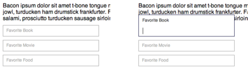
Unfortunately, this approach still hides the label when you leave the field so you can loose context by not seeing the label. So in the sample, it could be difficult to tell what the value really represents.

This was an interesting idea to prototype out and it may have some uses, I still prefer labels on top of the fields.
38 Notes/ Hide
 brendaca83-blog liked this
 briansrichards posted this