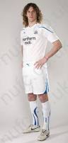
Newcastle United and Puma announced an extension of their kit deal today. The deal extends another “decade”. Still unclear the exact dates but those details can be hashed out later.
[Update- Seems 2020 is confirmed date per @Lee_Ryder- not 10 more years from now.]
Some themes- Many people have noted the condition of both the fabric and construction of many kits seem cheap. I’d have to agree. Are the replicas the exact same materials the players wear? If so it does seem sub-standard. Do other puma teams have better quality or is this a standard across the board for the brand?
Many of the kits look like training tops. So much so it was hard for me to actually remember when looking back which ones were which. Many of the jerseys are simply uninspired.
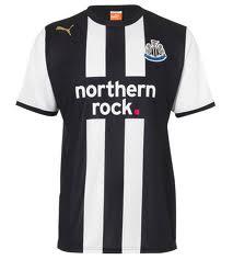
Home kits- my biggest complaint is that Puma have struggled to make the stripes look simple. Many have been cluttered and included extra design elements that weren’t necessary. They have also had a tendency to include colors that don’t fit with a black and white palate.
Alas, without further adieu:
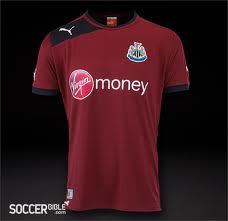
#14- Maroon. Bad grandma color, boring, nothing to talk about.
#13- Another boring color that looked extremely monotone. Especially when matched with shorts and socks.
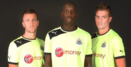
#12- Tried to follow the bold, neon trend but it honestly looked more like watered down piss than a bright, fresh yellow.
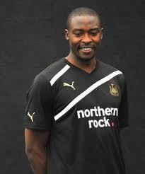
#11- I just hated this kit. Terrible collar, terrible season. Like the gold accents that they use/have used. Would like to see it as standard.
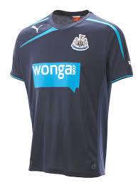
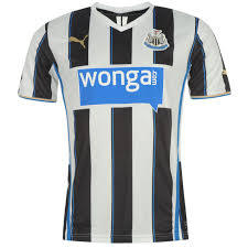
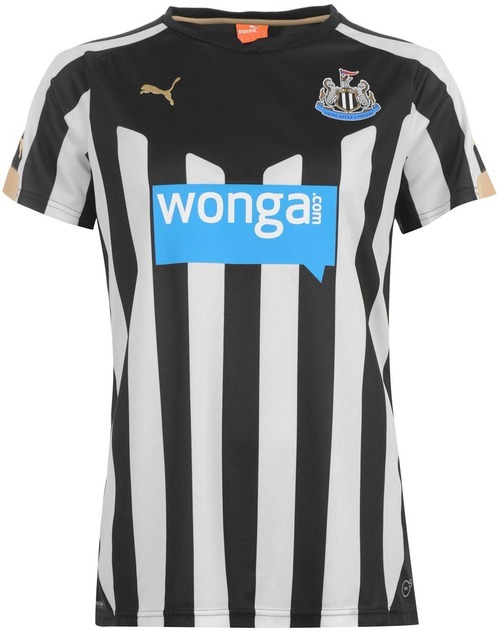
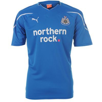
#10- Too much blue accent. Maybe a coincidence or maybe to try to fit Wonga blue into a b/w top. Honestly didn’t look that bad live.
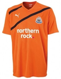
#8+9- Too similar to break out separately. Gold crest is great on the black top. Orange was an actual fun and fresh color.
#7- Really don’t think these will be that bad live. Not the catastrophe people are making it seem in my opinion. Jury still out for me.
#5+6- Same story as 8+9. Very similar but really nice colors. All whites looked great. Blue was a bit monotone but at least was a nice color on the eyes.
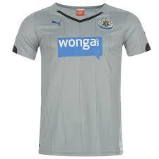
#4- Like that it’s a throwback. Subtle pinstripes are also a nice touch. Not in love with the monotone look as previously stated. It’s A LOT of grey. Haven’t really seen them play in them either so reserve the right to update.
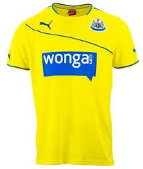
#3- Yellow actually fits well with blue Wonga logo. Worked well with shorts and socks. Great joke that we “play like f***kin’ Brazil”. Cabaye scored and won at Old Trafford in these.
#2- Cluttered, yes, but has to be given a high spot for second best home kit. First home kit back in the premiership. Halloween 5-1.
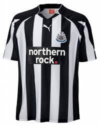
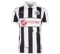
#1- Great job of simplifying black a white stripes while still keeping the heritage and look of them. First use of gold accents. Amazing season as well.
There you have it. Welcome any thoughts and opinions. Here’s to hoping Puma ups their game over the coming seasons.