To Park or Not to Park

@toparkornottopark / blog.toparkornottopark.com

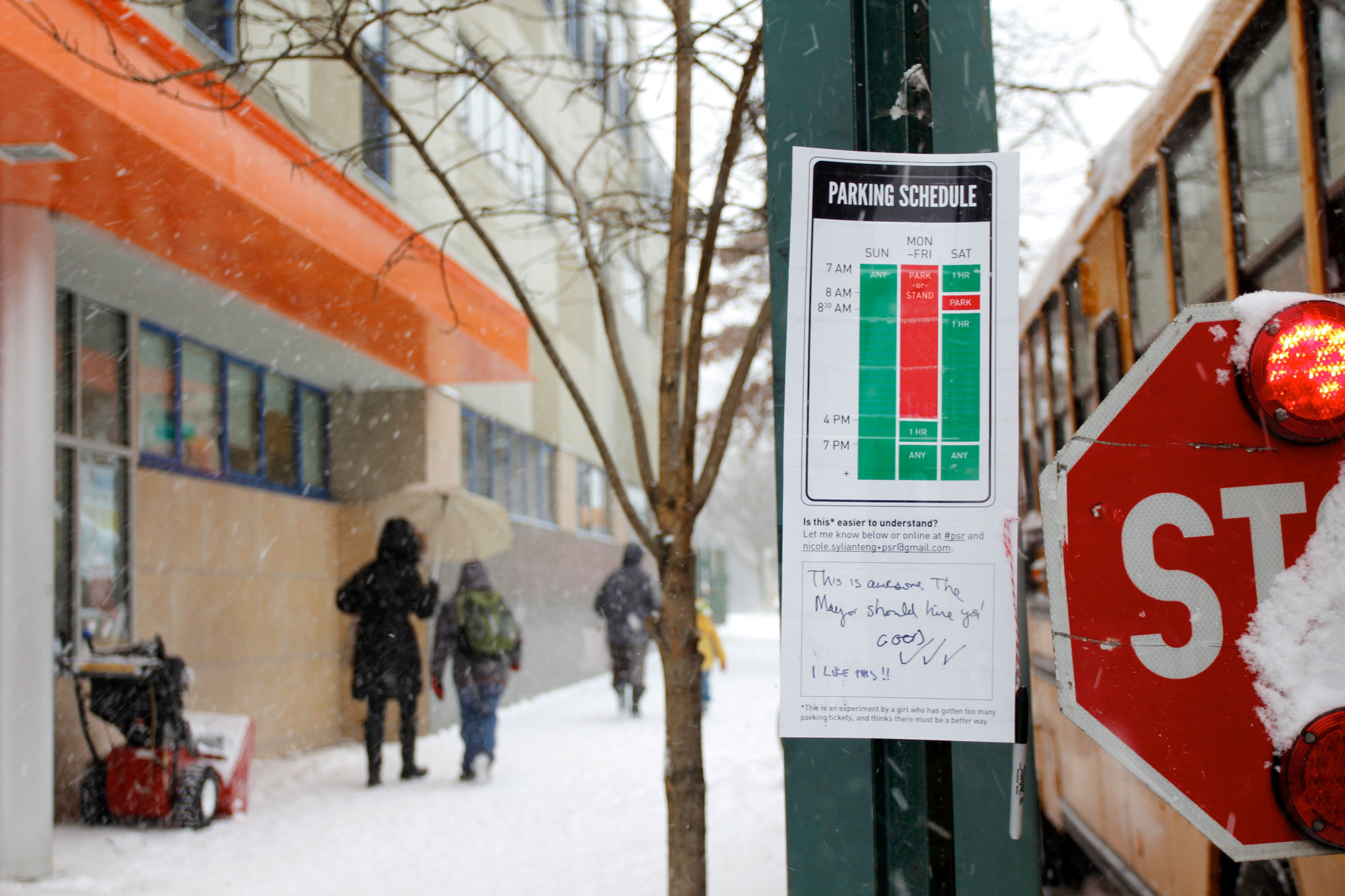
A guerrilla parking sign redesign project by Nikki Sylianteng
Avatar
Avatar

Mary Aviles, with the Data Visualization Society wrote about the parking signs and and went in depth about the process.

Shifting her design framework from the perspective of enforcing the rules to that of a citizen trying to interpret the rules and prioritizing diverse community participation resulted in a more successful design. Amidst this shift, Nikki exercised a participatory mindset and signaled a generative approach: that she recognized the expertise represented in the community and that hers was, at this point, the role of facilitator. 
Avatar
Avatar

A year ago this month, I appeared on the investigative news segment CBS’s “2 On Your Side” with Kristine Lazar. Kristine dug into what happened to the LA pilot and got the city to respond, saying they plan to deploy the new signs for all of LA’s 4+ panel parking signs in 2019 through 2020. We’ll wait to see if that’s true!

Avatar
Avatar

The parking signs have been finding their way into a lot of STEM/Engineering circles. Recently it came out in a textbook called Technology: Engineering Our World, which “provides students with an introduction to the made world and illustrates how they can contribute to that world through designing and making products and services.” Thanks to co-author Malcolm Welch!

Avatar
Avatar

I love this brilliant transformable no parking sign for an area that's sometimes the site of large community gatherings. Found in Buffalo Grove, IL by my friend @annelibby. Can you tell what it says when closed?

Avatar
Avatar

Dan Nosowitz interviewed me for a feature insert in the 99u magazine about redesigning cities. If anyone knows how I can get my hands on one, let me know. These photos were kindly taken by my fellow Manileño and Adobe Resident Christine Herrin at this year’s 99u conference. 

Avatar
Avatar
Compliance with parking rules at trial sites has skyrocketed, with up to 60 per cent improvements at some sites, resulting in less confusion and fewer parking fines for motorists...

Lord Mayor Graham Quirk, official press release from Brisbane, Australia

Avatar
Avatar

The signs are being considered in Oak Park, IL. You can read some of the comments on this public feedback page. Only thing is I wish they used the template for cities since I noticed their version isn’t colorblind-friendly! Thanks to Kyle Eichenberger for emailing about this!

Avatar
Avatar

The City of Columbus wanted to use the new signs in downtown High Street. Unlike other cities, their local FHWA (Federal Highway Administration) wasn’t comfortable approving the signs. So they’ve had to request permission for experimentation on the federal level. Here’s the section on Experimentation from the Manual for Uniform Traffic Control Devices or MUTCD. 

The request was denied due to insufficient evidence of (1) legibility and (2) comprehension. Columbus persisted by asking for actionable feedback which is what they’re working on today (see email below from Columbus sign engineer). You can view the complete application and the FHWA’s response in this Google Drive folder

My thoughts: 

  1. Legibility - This is a fair point. Current road signs are tested for legibility so the new ones should be too. This is an issue that came up in the LA pilot -- some people complained it was too small to read. My thought was, current signs may be readable but they are incomprehensible. Whereas the new signs might be dead simple comprehensible, but unreadable from afar. My question is what is the ultimate purpose of reading from afar and can that be conveyed in other ways? If the purpose is to get just enough information to know whether I should take a closer look (because reading 2 HRS doesn’t really tell you whether you can park there), then can that be conveyed graphically in a way that’s understandable from afar? More on this next time. 
  2. Comprehension - We were surprised this was brought up because it seemed so obvious that people can never tell whether they can park or not. Added to that, according to one of the largest parking sign manufacturers in the country, current signs aren’t tested for comprehension at all. Yet this is the current standard. From the number of parking tickets issued, one might conclude it has failed this test. But let’s set that aside and try to look at the best case scenario. The best case scenario is that simple signs are tested for comprehension and people get it. The problem is with complex signs. This is what the new signs aim to address. I realized that testing the new signs for comprehension will also be the first time current complex signs will be put to the test. 
  3. Experimentation - Isn’t the point of applying for Experimentation to answer the questions above? Apparently, a proposal needs to be experimented with before it can be approved for experimentation?? My best guess is they are concerned that it will be a safety hazard. 
  4. Pitch - The application could be better. I realized that the ways in which the new signs are an improvement needs to be simply and clearly articulated in a way that makes it easy to get others on board.

I have a lot of ideas for addressing these including a quiz (tests comprehension) and a parking sign hotline (tests comprehension and also actually useful!). A couple grad students interested in doing usability tests reached out to me this week and I’m so happy they did! It’s going to be super helpful. I am after all supposed to be giving you all ways to take on a more active role. I should articulate these ideas more clearly soon but if any of you all are interested in helping out, let me know! You can email me at nicole.sylianteng@gmail.com.
You are using an unsupported browser and things might not work as intended. Please make sure you're using the latest version of Chrome, Firefox, Safari, or Edge.