Monday’s “actions” by the Uk government were a series of recommendations rather than any enforceale legislation, although there are possible plans for such in the future. But the population has responded with a dramatic efforrt at “social distancing”, which can be hoped to achieve some impact. Of course, given the uncertainties over the average length of the incubation period, it is uncertain when this will be translated into impact on number of infections. Sadly, th government continues to take a rather “relaxed” attitude to the introduction of virus testing.
Fortunately (at least on superficial consideration), the problem has so far been less severe in the UK than in some other countries: numbers of patients with confrmed infections and numbers dying of the disease have been lower. But a more careful analysis of the data suggests that there is absolutely no justification for complacency.
The variation in the use of testing makes it difficult to make valid comparisons of “infected patients” between countries, or even across time in a single country if testing policy changes - this was seen in figures from China. In contrast, though, figures for deaths from the disease are not subject to such uncertainty, and can be used to give a better idea of the course the disease is actually running and is likely to take if uninfluenced by public health measures.
Much data is nw available, from many countries, and in nearly every case the rise in numbers of deaths initially follows an exponential pattern. This can be clearly seen by plotting the figures semi-logarithmically, when a staright line is seen.
In countries where effective public health measures have reduced the numbers infected, this line’s rate of ascent declines towards the horizontal - this can be seen clearly in figures from China
https://www.worldometers.info/coronavirus/country/china/
No European countries have yet achieved such a reduction, and all the lines are rising at a steady gradient. Interestingly, but perhaps not surprisingly, this gradient looks fairly constant from one country to another, although there are still too few data points to be confident about this.
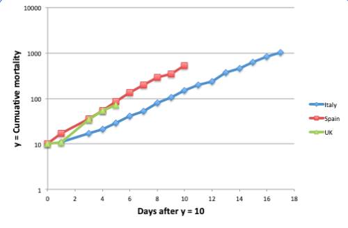
The graph below shows the position as of the morning of 18th March 2020, which shows the rising death toll in the two most badly affected countries, Italy and Spain, and also the UK. Note that the time axis is not by actual date - a starting point, “Day 0″, has been chosen as the day on which the total deaths reached ten. As the numbers in the first few days are small, random variation affects the data; but as the UK figures only exceeded ten three days ago, it is useful to keep this starting point. It CAN be seen thogh that the Spanish and Italian lines show a very similar rate of increase, and the early data suggest that the UK one will behave similarly. Given the incubation time and clinical course of established disease, we must assume that infection that will prove fatal has alrady occurred to the extent that the number of deaths will reach over one thousand in about a week’s time, and will continue to climb towards a figure of ten thousand by about the middle of April. Even if more drastic measures were introduced tomorrow, such approximate figures are almost certainly unavoidable.