this post is blacklisted because it contains and is not fully visible on the index page. the link takes you to the permalink page. click here to view it.
this post is blacklisted because it contains and is not fully visible on the index page. the link takes you to the permalink page. click here to view it.
this post is blacklisted because it contains and is not fully visible on the index page. the link takes you to the permalink page. click here to view it.
How I Colour the Thing!
A while back I made a little process post on the Spider Forest forum explaining my colouring process on behalf of a request. I’ve been meaning to transfer that post to my comic blog since the process is still relevant, so here you go!
______________________________________________
This is more of a step-by-step since I don’t know how to teach things, so I apologise if this isn’t helpful.
Before I get into my process, as you all may know the type of paper and pencils you use is super important. Soft pencils equals grainy lines, and the same is said for bumpy or low quality paper.
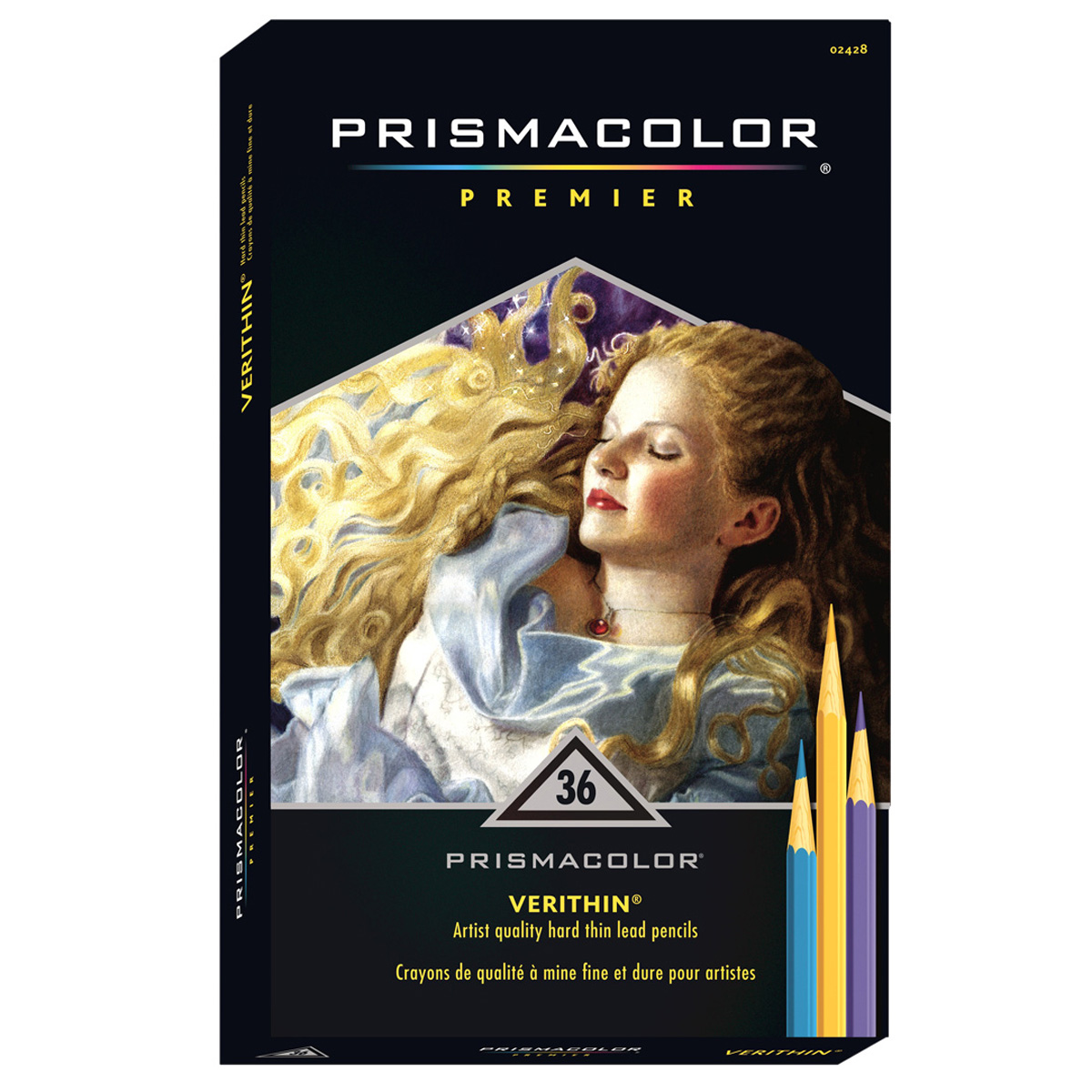
Personally I use Prismacolor Verithin pencils. Unlike the company’s Premiers they are harder, which makes smooth shading easier to accomplish.
Also when shading it’s best to take your time to make the colour even. This means making small circularish strokes rather than large zigzaggy ones. This method does take much longer, but it is more effective in making the colours come out smoothly. (I would post an example gif, but my phone and webcam can not video)

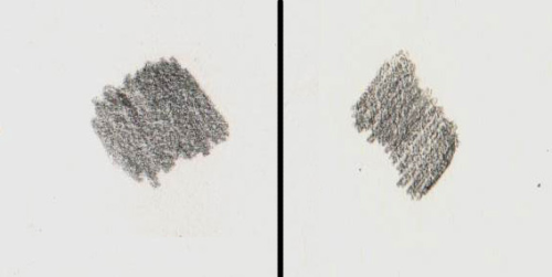
Here is a side by side comparison between a Verithin (left) and a Premier (right). If you observe, the Premier is totally ew! Gross!
Although they are nice, the downsides to Verithins are 1) they scratch, 2) they break in the sharpener. I’ve been using them for long enough to know how to work around these, particularly the breaking problem. Rather than using art sharpeners, I now use this iPoint Evolution sharpener which has left my pencils with very little breakage.
Despite this I would suggest exploring with other pencil brands. If you like watercolour pencils Kimberlys aren’t too bad. I would also suggest watching this video, which lists some good alternatives that I may try out myself one day.
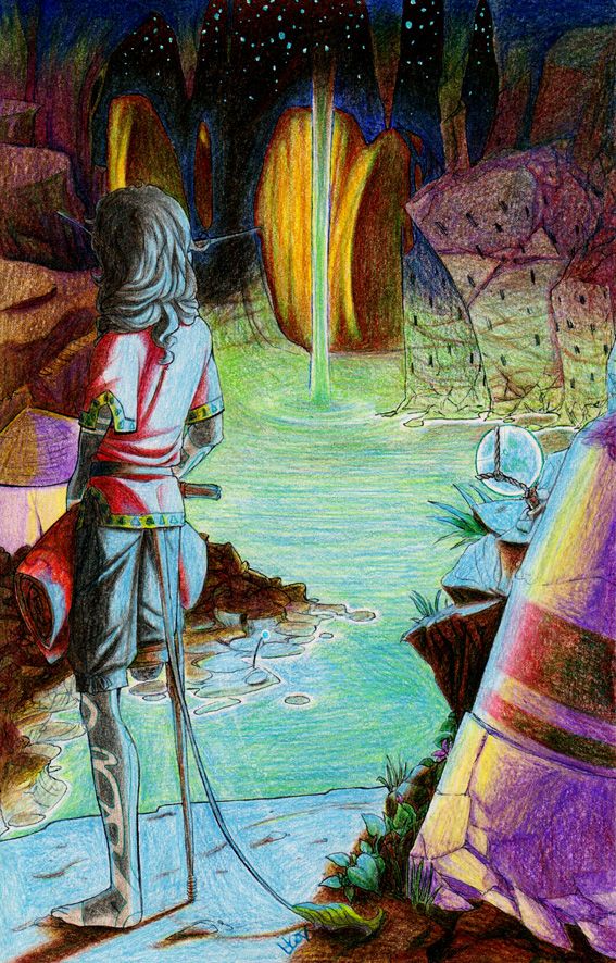
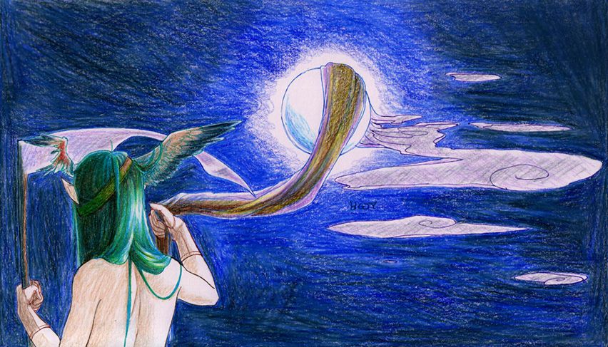
If you would like a more blatant comparison here are two drawings I did in 2010:
- This was done with Verithin pencils on sketchbook paper, surprisingly enough.
- This was done with Premiers on the same paper type. (I clearly got very impatient with the black on this drawing)
Now to paper! I use 9in x 12in Canon brand bristol board. Don’t let the super redundant, cheese name fool you! Going by texture and thickness, this “mango comic illustration paper” is in fact bristol board.
For nice, silky shading it is best to have smooth, more heavy duty paper.
Here is a comparison of the “mango comic paper” (left) and normal sketch paper (right). This one is less noticeable because my scanner is amazing, but the left does give smoother lines. Other paper that works well is smooth mixed media paper, and thicker drawing (not sketch) paper.
______________________________________________
Now onto my process! To start off, I layer A LOT so there will be a bit of repetition in this step-by-step. The pencils below are all the ones I’ll be using for this page, and are what I normally use.

Because my memory is the worst thing ever, I start off using lightish blue to lay out all the shadowed areas. It will be covered with other colours later, so quality doesn’t matter. But doing this also gives the visuals a nice, cool look… not cool as in awesome, just cool as in… cold.

Next I shade in the mid-tone, which is the colour between the shadow and base. I always use purple since it’s sort of between a cool and warm colour. Then I tighten it up with other colours later if needed.
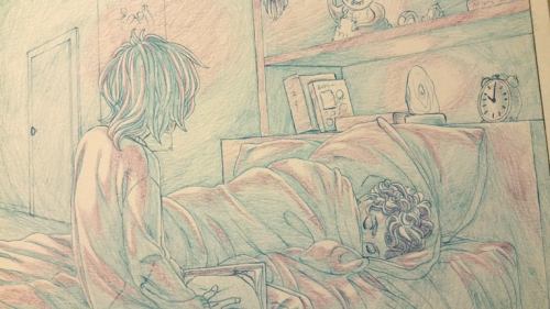
Now that the mid is done I go to the base colours, which are the actual colours of the things. I start off light for the best blending affect, if you go too hard the drawing will come out muddy. When darkening you want to start out with the shadows first and work your way to the base and lighting.

Next I overlay the shadows with brown. Not too hard since this is just to darken the colours I’ll be using for the shadows. If I don’t do this the page will look like something from ‘The Yellow Submarine’, and the fun of LSD ain’t what my comic is about!
The shading still looks gross, but it’ll even out as the final colours are added.
Here is what the page looks like after the brown.

Here is a comparison of the brown against the blue.

To note: If you use verithins there are two different browns, dark umber, and dark brown. Dark umber is much stronger and is best for dim scenes, while dark brown is tame which makes it nice for light blending or brighter scenes.
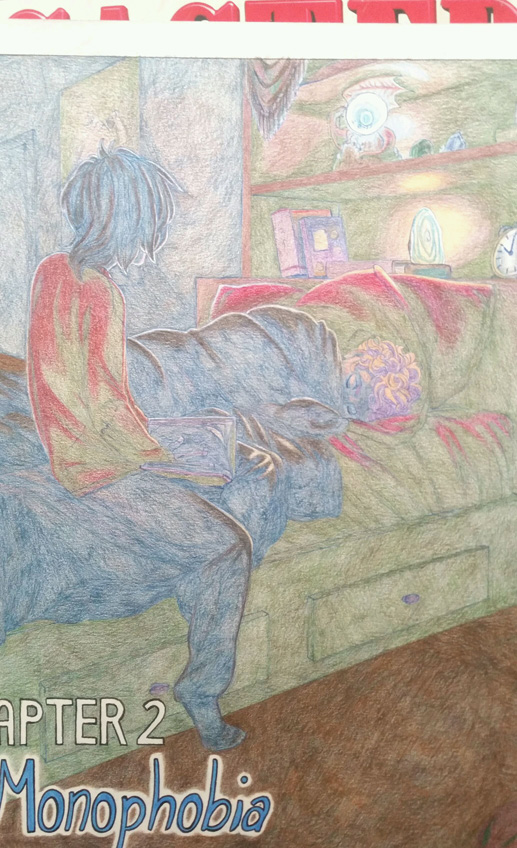
After that I finalise everything starting from the shadows to the base colours. Yes, it still looks gross thanks to my awful phone camera.
I was asked once how my colours came out so rainboweeeee. Let me show you this colour wheel.
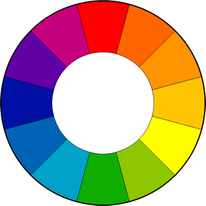
Alright, this is simple. I like taking the base, make the shadow the opposite colour and use a colour in between (always on the cool side) for the mid-tone. So if my base colour is red, I’ll use green for the shadow and purple for the mid-tone. If the base is purple, I’ll colour in the shadow with brown and overlay it with yellow, making it a brownish-yellow and make the mid-tone blue. I like to pretend my base colours stand out by using brown for the darker stuff.
Now to the scan and cleaning process!
This is the scanner I use: A Mustek A3 1200S - High Speed A3 Large Format 11.7-inch x 16.5-inch Color Scanner! Used to be $170 on Amazon, now it ranges between $400 - $800 for a used one. Lmao!

I like to scan via my Windows Photo Gallery because I like to see what I’m looking at before I commit to it.
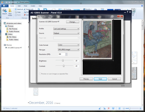
Above are the setting I scan at. I scan the picture in darker so I don’t lose too much of the lighter colours.
I clean up the image in Photoshop CS2 using the levels.

Then I save it as this.
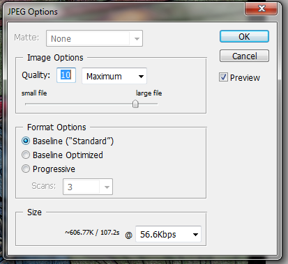
I’ve heard that saving your stuff as JPEGs is bad, but honestly when I save my drawings as PNGs they turn out kinda grainy and ugly.
And bada-bing bada-boom, here is the final product!
______________________________________________
Anyways, that is my process. I hope this turned out useful in some way. Feel free to let me know if there is anything you would like me to elaborate on more, or if this is a total mess that needs to be fixed. I’m pretty sure I got dyslexia, so I may have misspelled or mixed up some words.
greykolla liked this
shutupsocrates liked this
danisfantasticmoustache reblogged this from tgtahr
tgtahr posted this