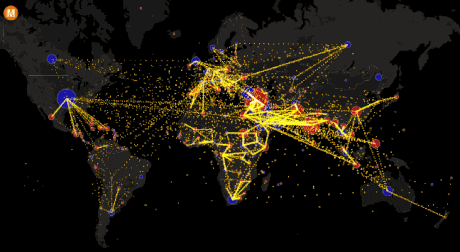
Net country-to-country migration, 2010-2015
Net country-to-country migration, 2010-2015
These maps, from The Atlantic Cities, show net total migration, net domestic migration, and net international migration to and from US cities.
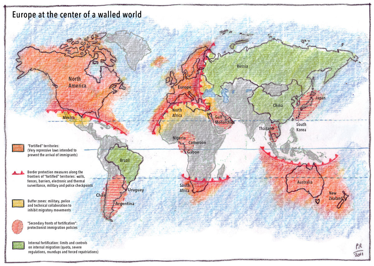
This map, by Philippe Rekacewicz, shows the areas of the world with significant limits on international and internal migration.
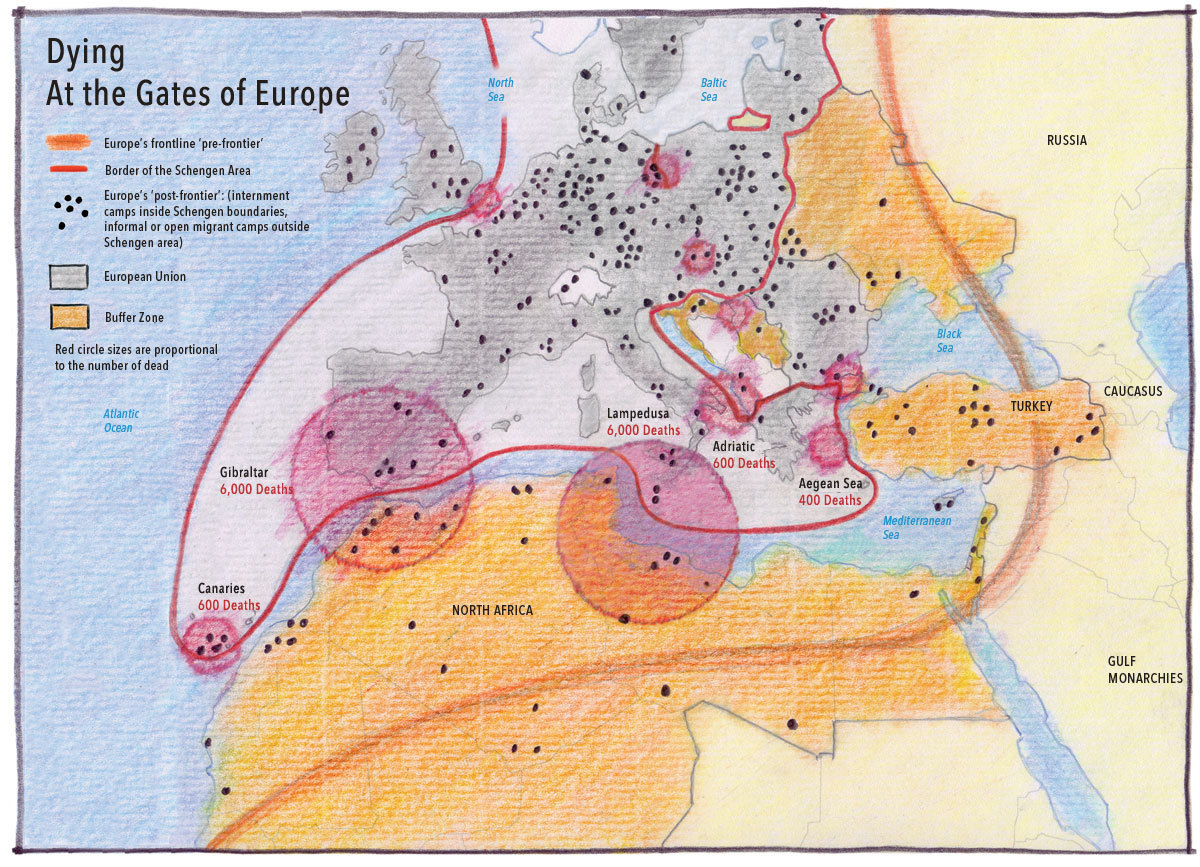
This map, by Philippe Rekacewicz, shows some of the details of Europe’s recent immigration waves.

This map, from The Economist in 2011, shows the worldwide Indian and Chinese diasporas.
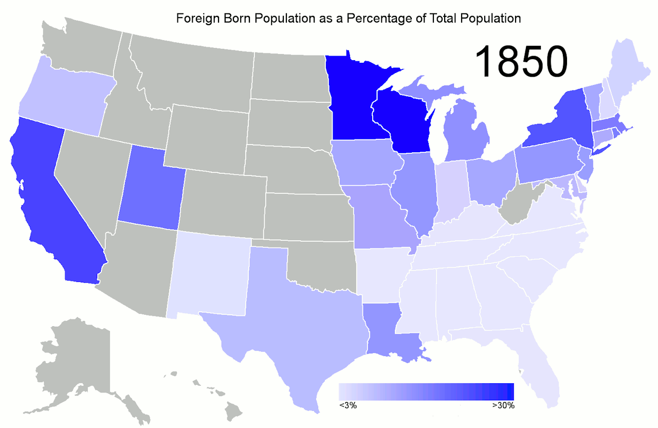
This gif shows the foreign born population of each state in the US as a percent of the state’s total population for each decade between 1850 and 2010.
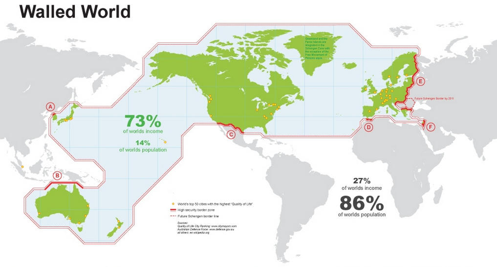
“Walled world” - the uneven distribution of population and wealth worldwide - Theo Deutinger
An old post that suddenly seems more relevant than ever

Costs of citizenship around the world
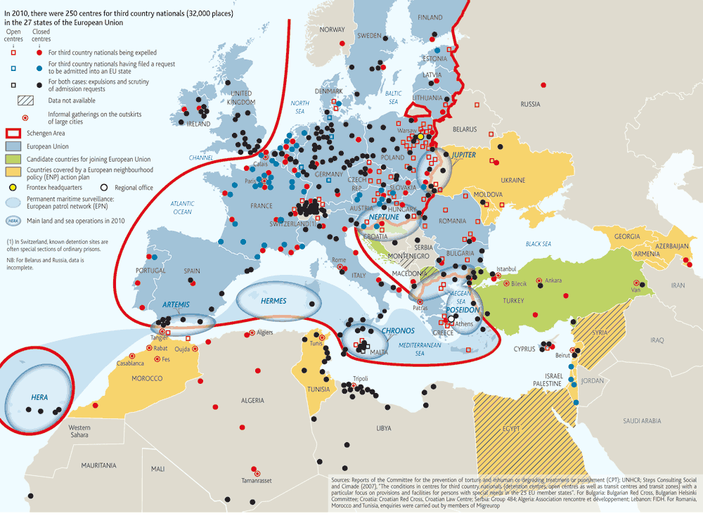
Immigration centers in Europe, from Le Monde Diplomatique

Great Friesland
