
Accessability
We are in 2023, why do we still need to have this discussion?
If you're an icon or gif maker and make resources smaller than 100x100, then you should consider also releasing the same set but as 100x100 or 125x125 so more people can use your resources. Because when saving an icon/gif you can choose what size you save it as. Which means you could easily make them bigger from the start and then when saving them make the second set of the size you desire. But PLEASE think about other people who want to use your resources but can't because they are too small. Then also try and use psds that make it easy to tell what is in the icons, so not too grainy, and or contrasting colours on the icon so you can’t make out who it is, or what facial expression they’re making. Like the point of icons or gifs is to be able to make out your characters face, what they’re looking like for the moment of the reply.
I should also mention i am a resource maker and run the blog thelovelyicons
It’s the same with themes, please use fonts that are considered accessible, and don’t use double small, double spaces, or fonts smaller than 12pt. Because those options make it harder for people to read. Especially people with disability, and double spaces make it so screen readers can’t read the posts.
Then there is the themes, don’t make them too small, or too busy. Make sure your links are easy to find, like a drop down menu, or straight up just a link bar under your description or next to the description. And for example, make sure your text is dark enough, or light enough to contrast against your background colour.
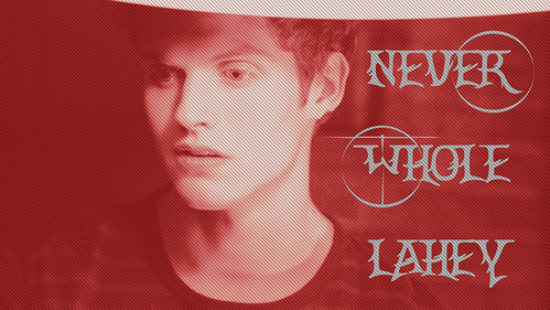
Something similar for graphics, make sure it’s easy to tell what’s in them. So again, don’t make them too busy, or use psds that make them hard to tell what’s in the graphic you’ve made. Like the promo graphic.
So please consider that what is accessible for you, is NOT accessible for everyone.
On a side note, I’m not considered disabled. However, I have friends who are, and some of the aesthetics of today, make it hard for said friends to use and interact with a majority of blogs on this site. Which saddens me a lot, because I want them to be able to experience this place as much as I can.
Thank you for reading this. Let’s help make tumblr more accessible.