
poppybat reblogged
@poppybat / poppybat.tumblr.com
To Deconstruct a Geranium.
🥀
The way somebody comes back - but only in a dream.
SINBAD:LEGEND OF THE SEVEN SEAS (2003)
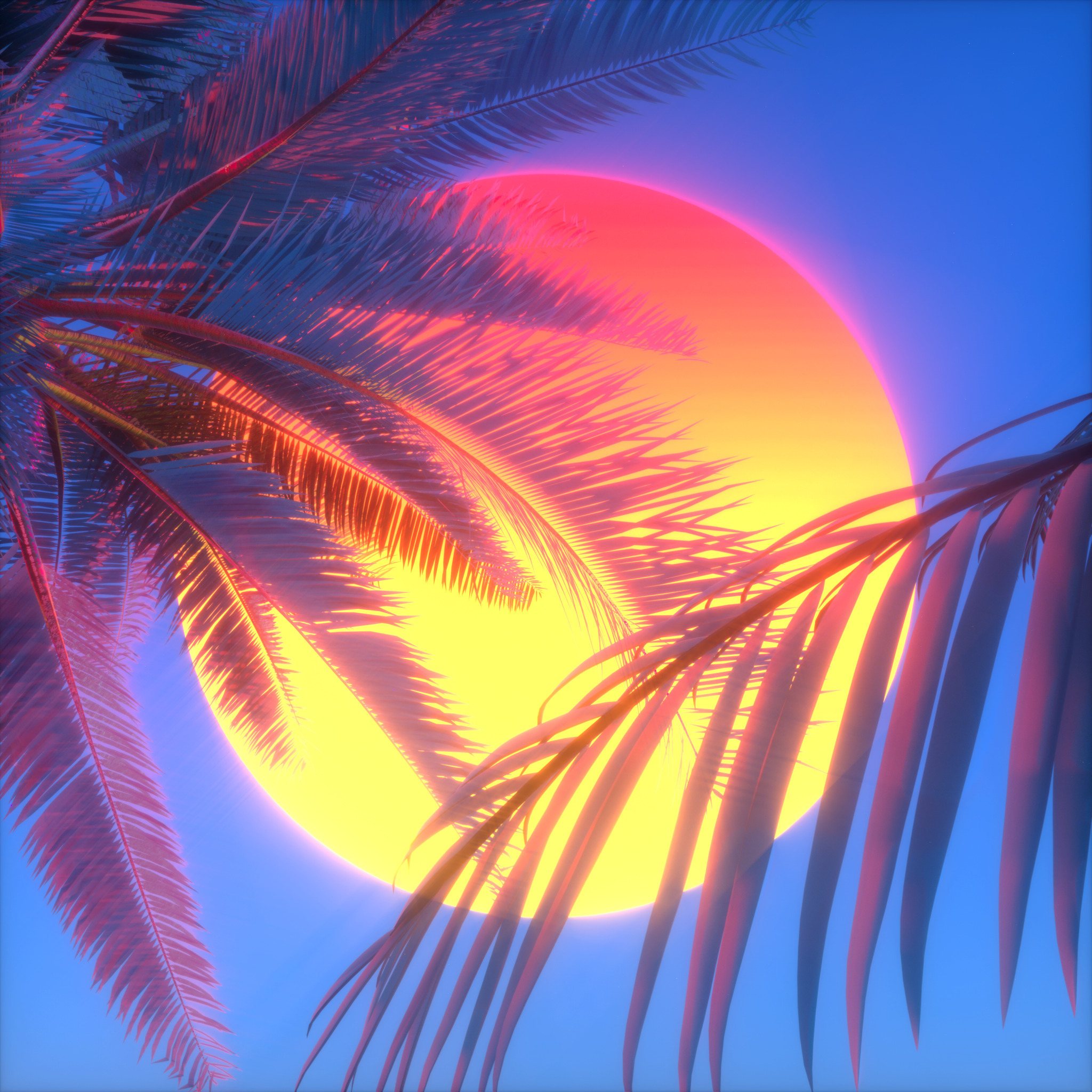
VHS Ocean V2
this website blows for so many reasons
Figures of Apollo, Mercury, Pallas and Peace. 19th.century after Jacopo Sansovino Italian 1486-1570. carved wood with bronze patination. Christie's Sept. 2013. http://hadrian6.tumblr.com
Dungeon Meshi Episode 7 was super interesting from an adaptation standpoint - this'll be a little different from what I usually write about (though I do still talk about the animation in the full video).
Studio Trigger have never done a straight-up manga adaptation before - and led by Yoshihiro Miyajima, a big fan of the manga who pushed hard for the adaptation to get made, and who has never directed a full series before, it was unclear if they'd be able to find the right balance between a simple panel-for-panel recreation and making something that's completely different.
And in the first few episodes, you could really feel the tension between the influence of a cautious young creative with great respect for the source material, and a studio with a unique established visual style. It kinda seemed like they were ping-ponging willy-nillily between the two sides of that spectrum.
But this episode showed that Miyajima (and series writer Kimiko Ueno) can take 3 chapters, slice them up and rearrange them into a cohesive-feeling episode while taking into account the differences between screen and page, and using them to their advantage.
Starting with the way the water looks. This line from the manga describes a faint magical glow to the water in this lake and you can see that the cavern fades into darkness above, but Kui's illustration style doesn't really define lighting and shadows very much compared to the cel-drawing style of animation. So the animators took the opportunity to use the water as the light source, and make a whole episode that's lit almost entirely from below. It really gives an otherworldly feeling to this area.
Particularly when the Kelpie shows up, that under-lighting works wonders to define its anatomy within the relatively simple line art.
What do you do when you can't show the immense fuck-off scale of a monster with a beautiful full-page spread like this?
Well you use what you do have: the ability to move the camera instead. This is such a great way to communicate the scale of this thing, AND such a great way to show some of Senshi's anime-original butt-cheeks!
This is one of my favorite shots from this episode - this whole sequence is super hectic, cutting quickly from character to character, but they use tricks like this to keep you from getting confused. This is framed much like it is in the manga, but with the moving image, they're able to use the trajectory of the fish head in the background to lead your eye directly from Chilchuck, right to the point where Senshi pops up in the foreground and transition seamlessly from one character to another!
Now, it's not all good - I am a bit disappointed that they removed Marcille's own Senshi-style soap-making montage, which was the perfect visual representation of the culmination of the character development and understanding built between Senshi and Marcille.
It's a shame to see it go.
I get more into that, what else was cut, and much more in this video where I broke down the entire episode!
Check it out if you feel like it. If you don't, jump in a ditch, cover yourself in leaves and jump out at people as they walk by.
Thanks for reading!
This sword fight isn’t even that homoerotic dude I think I’m just gonna kill yo,u
people get specific as they age
:O


