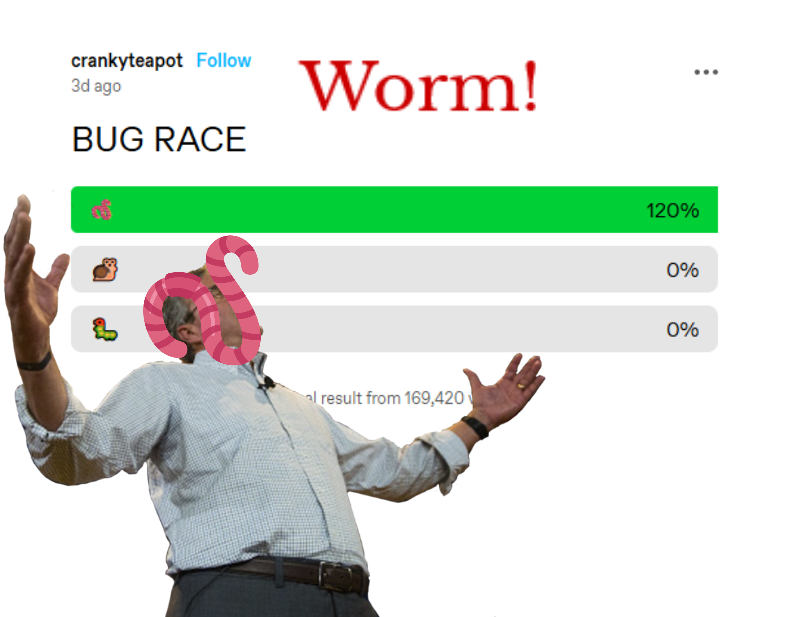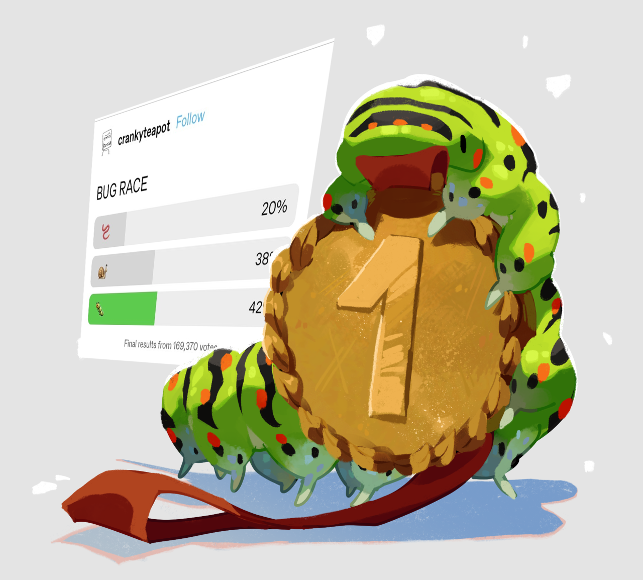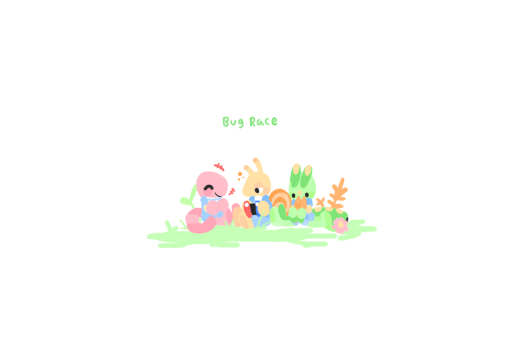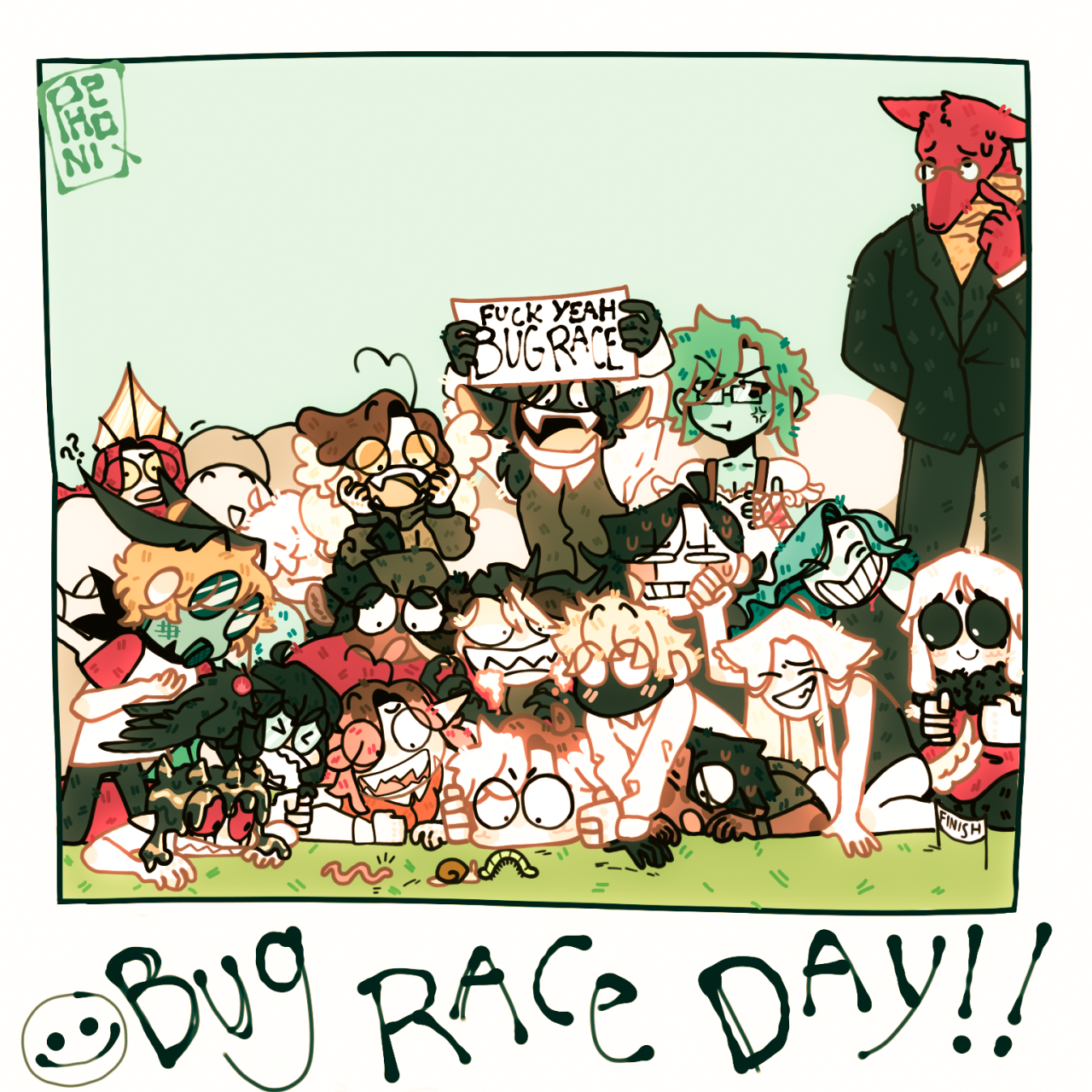

he’s so happy that he won :) 🐛🥇
he’s so happy that he won :) 🐛🥇
See more posts like this on Tumblr
#bug race #team caterpillar #caterpillar sweep #kfisher posts #kfisher art
You people better keep this meme trending so I can finish this while it’s still popular 😂
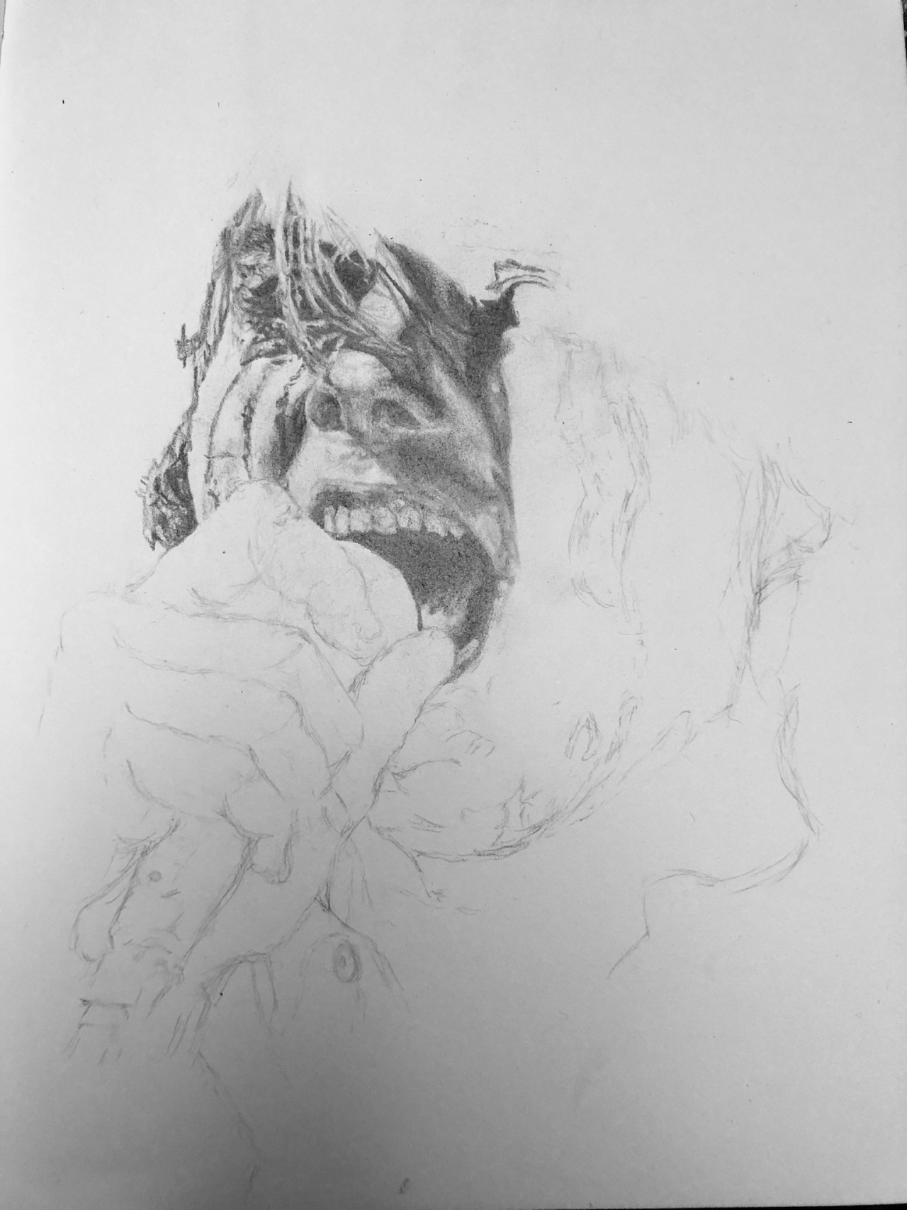
Currently working on a portrait of Gerard Way and having a real difficult time with it due to the poor quality of my paper 😔 but I think it’s turning out nice regardless!
Click for better quality <3
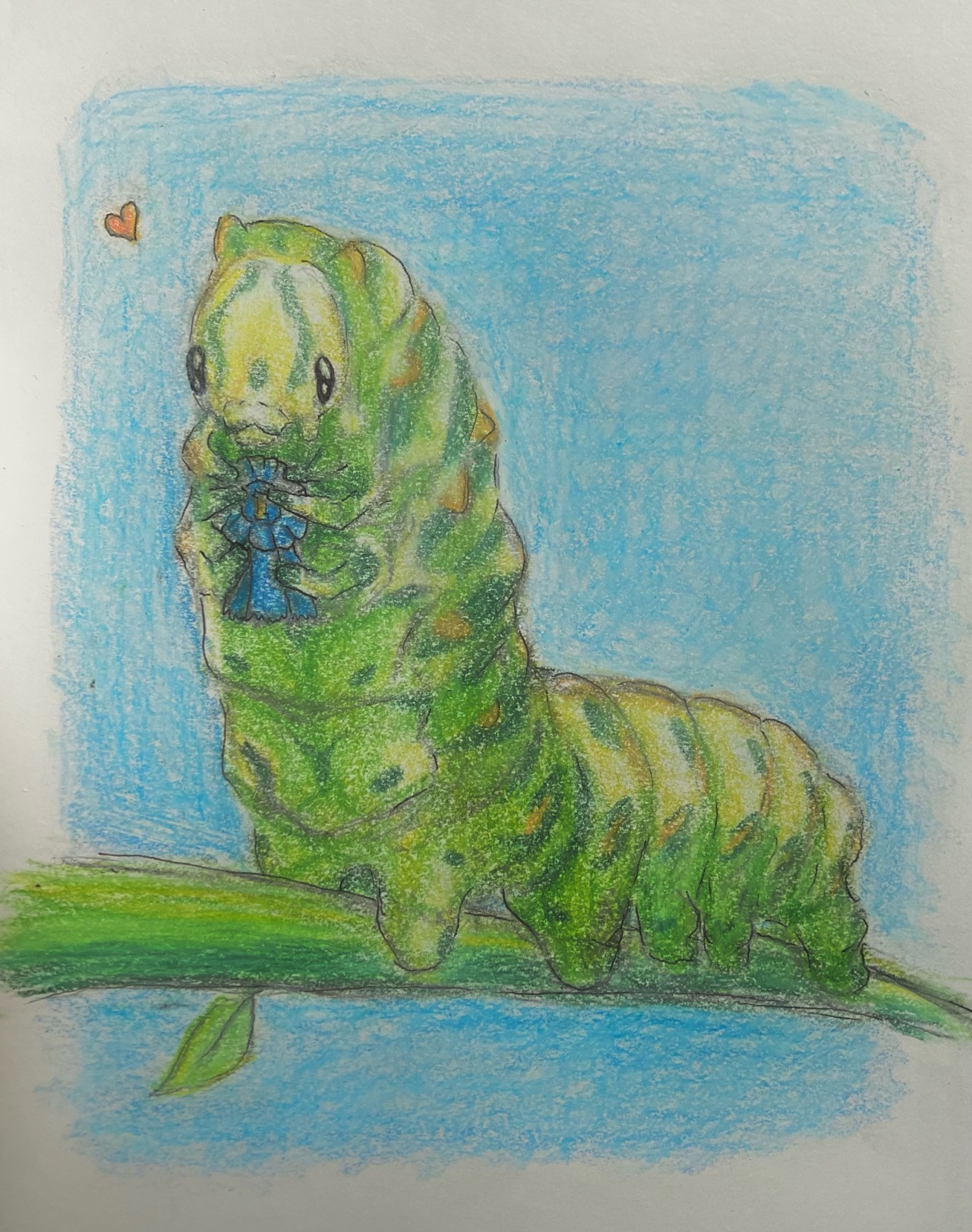
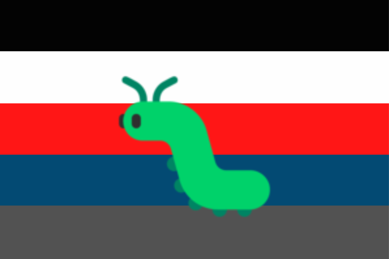
he’s so happy that he won :) 🐛🥇
ID: pencil art of a green catapillar on a stem. it is holding a blue winner's rosette in its first four legs. the background is blue. end ID.
![doomhope:
“urgetocreate:
“Fred Danziger, French Creek Drift, 2010, Oil on canvas
”
[ID: Hyperrealistic painting of many fallen leaves floating in water. End ID]
”](https://64.media.tumblr.com/0526cf3bb86a2120a9c6cb44d73e6282/b4b49e4305a5af74-03/s1280x1920/51730e4540b40c0753a8b03bd52695b616f42833.jpg)
Fred Danziger, French Creek Drift, 2010, Oil on canvas
[ID: Hyperrealistic painting of many fallen leaves floating in water. End ID]
oc. no ones gonna see this but i like him
his name’s arbor and he’s a tree spirit!
writers and artists! what's your favorite snack to eat while writing/drawing?
something sweet (chocolate, hard candies, caramels, etc)
something savory (mixed nuts, chex mix, etc)
fruit
chips
vegetables (hummus, celery, etc)
combination of these
depends on the day
other (put in the tags!)
i don't usually eat while writing/drawing
not a writer/artist, i just wanted to see the results :D
See Resultsreblog perhaps?
what they don’t tell you about making art is AAAAAAAAAAAAAAAAHHHHH!!!!! AAAAAAAAAAAAAAAAAAAAAAAAAAAAAAAAAAAAAAAHHHHH!!!! AAAAAAAAAAHH!!!
Well, fellas, you did it again. And by "it," we mean utterly surpassed our wildest dreams for what polls could be. Like, shot-past-the-target-onto-the-moon-then-past-the-moon-and-now-orbiting-some-cosmic-bug-head-planet-somewhere kind of surpassed. Here's a round up of some of the fun folks have been having around crankyteapot's inaugural poll meme.
@your-fave-is-not-osha-approved:
i hate that every time i look for color studies and tips to improve my art and make it more dynamic and interesting all that comes up are rudimentary explanations of the color wheel that explain it to me like im in 1st grade and just now discovering my primary colors
“red and green are opposites 🥰” cool now how do i paint a tree with pinks and blues without it looking like a child’s finger painting or incongruous blobs of rainbow vomit
ok i can’t explain it very well but im looking for tips and techniques for rendering art like

with specifically the highlights and colors being hues that compliment each other, don’t distract from the scene, and make it more interesting/visually appealing
is it too much to ask
gonna drop some sources I have saved on Pinterest! I don't know if these all link back to the original sources so apologies for that
cohesive but still contrasting
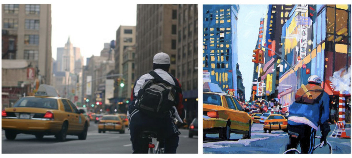
This kind of talks about color and composition
This is a bit about landscape specifically
This one's more for palette building but I think it's useful and can be applied to the other ones
Cohesion within compositions/lighting
"Chromatic fringe" - I also see people using this with shading, they bring in a transition color that is a different hue than the base color or shadow, it makes it so that less vibrancy is lost and it doesn't get muddy!
This one specifically has a lot of process behind the style of painting you're looking for!
Also one of my favorite artists who makes bright and colorful art like this is Not Sorry Art on TikTok & YouTube, her website is here and it's<3 my fav. She has some videos where you can see her process
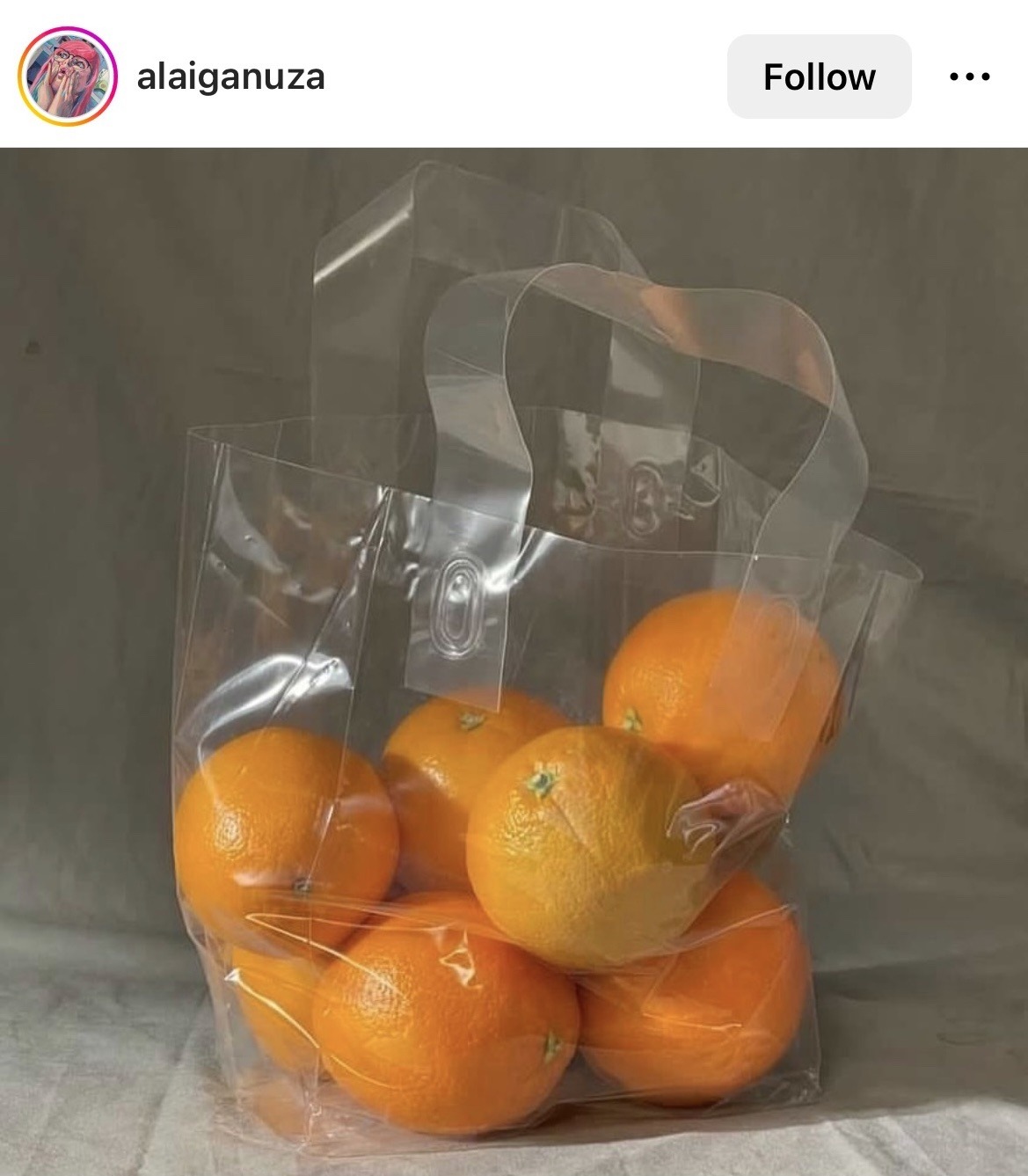
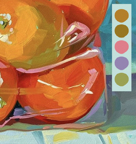
With the oranges painting you put as an example, I noticed they painted the lighter values more toward yellow - they also exaggerated the hues of the undertones of the photo, so I'm guessing they either did it in their head or bumped the saturation up to get a closer look! I really love these paintings you shared and I definitely share your desire to paint/draw like that :)
thanks this is super helpful! /gen